As the internet is well aware, after the ill advised firing of Mike Vrabel by the Tennessee Titans, I renounced my fandom for NFL franchise in Nashville and proclaimed my allegiance to new titans of mediocrity in Los Angeles, the Chargers. So far, that decision has paid off in spades. Yet Tennessee still had one ace up its sleeve – or, in football parlance – one last Hail Mary to bring me back into the fold. And that hand was played today by the unveiling of new uniforms.
So. The final verdict?
Underwhelmed.
For the record, this is not a bad uniform. But I’ve made my opinion clear to anyone who would listen. If the Titans want to be the Oilers, then they should stop with these half-assed measures. Go FULL ass. BE the Tennessee Oilers for fuck sake.
But alas, we get this halfhearted nod. Which is fine. But if they really want to send this uniform over the edge, do a light blue alternate for the helmet 👍
To be honest, there’s not too many uniforms I hate. In fact, this is probably the strongest year for uniforms since I’ve started following the National Football League back in 1923. That’s why it’s taken so long to write a follow up. None of these are bad! It’s just a small tweak here or there that I would change, but otherwise the NFL is having a banner year for uniforms. (Don’t forget, Roger Goodell will sue the SHIT out of me if repost any pictures here. So if you’re curious, just use Google 🙏 sry)
28. New York Giants
Before North Jersey dispatches the mafia to bust my knee caps, I should say that this is a good uniform. Honestly, I like it. In my mind, it’s one of the classic uniforms. It’s along the lines of the Dallas Cowboys, Pittsburgh Steelers, Green Bay Packers, etc. The problem is that it’s the weakest in that category. Ditching the grey pants of the Eli Manning era was a good move. While the white pants they’ve been wearing for nearly a decade has been a slight improvement, I think it’s time to make a switch to all blue/all white for home and away.
27. Buffalo Bills
The Bills are similar to the New York Giants uniform wise, but they do a much better job at managing the colors. However, this might be my most controversial opinion: I don’t like their logo. Never have. It’s one of the few logos that needs a modern redesign. Yet simultaneously, I think they should make the throwbacks — the red helmets of the Jim Kelly era — their full time uniform.
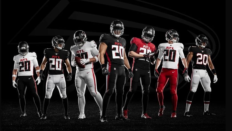
26. Atlanta Falcons
Someone, and I don’t know who, needs to stop overthinking this goddamn uniform. The answer is painfully obvious to both fans and haters alike: the Atlanta Falcons uniform is a red helmet, black jersey, and white pants. So, you hear me Arthur Blank? Stop fuckin with perfection!
25. Carolina Panthers
Panthers have a rare opportunity to go from the near bottom of this list to the absolute top. And we all know what the solution is. It’s no secret. Ditch the grey helmet and make the black one full time. That’s the obvious solution. But I have a better one: how about a blue helmet with an all black uniform for home games? Just sayin
With a book coming out, it feels like being down three points in the fourth quarter and cramming for the finals all in one. Stress has reached a boiling point. So with a lot on my plate, I need to write about something cheap and easy. And you know me. I always have an opinion about football uniforms.
It’s been a couple years since I’ve done this. So here’s my ranking for all the 2025 NFL uniforms. Unfortunately my beef with Roger Goodell is ongoing so I won’t be able to post pictures. But that’s what the internet is for folks 🤷♂️
32. Seattle Seahawks
I think we can all agree that this uniform has overstayed its welcome. Actually it was never welcomed to begin with. It’s just unfortunate that this was the uniform worn during the franchise’s most successful run. But with the Legion of Boom/Russell Wilson/Pete Carroll era over, it’s time to restore the throwbacks to their proper place.
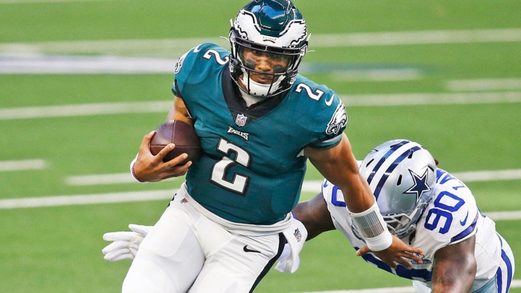
31. Philadelphia Eagles
For the life of me, I will never understand the love of midnight green. It’s boring as shit. And the shading behind the numbers makes the whole thing look dated. This uniform is stuck in the late 90s/early 2000s when everyone was depressed because of 9/11. It’s been nearly a quarter of a century, Philly. Bring back the Kelly green!
30. New England Patriots
Post Tom Brady, the Patriots have made improvements. I’ll admit, they have some good alternatives. But it’s still not enough. The biggest problem is the helmet, specifically the logo on the helmet. The internet has been quite vocal lately about the superiority of Pat Patriot over the current logo and I’m inclined to agree with them. But to improve the helmet, I have a much simpler idea: ditch the grey and make it white.
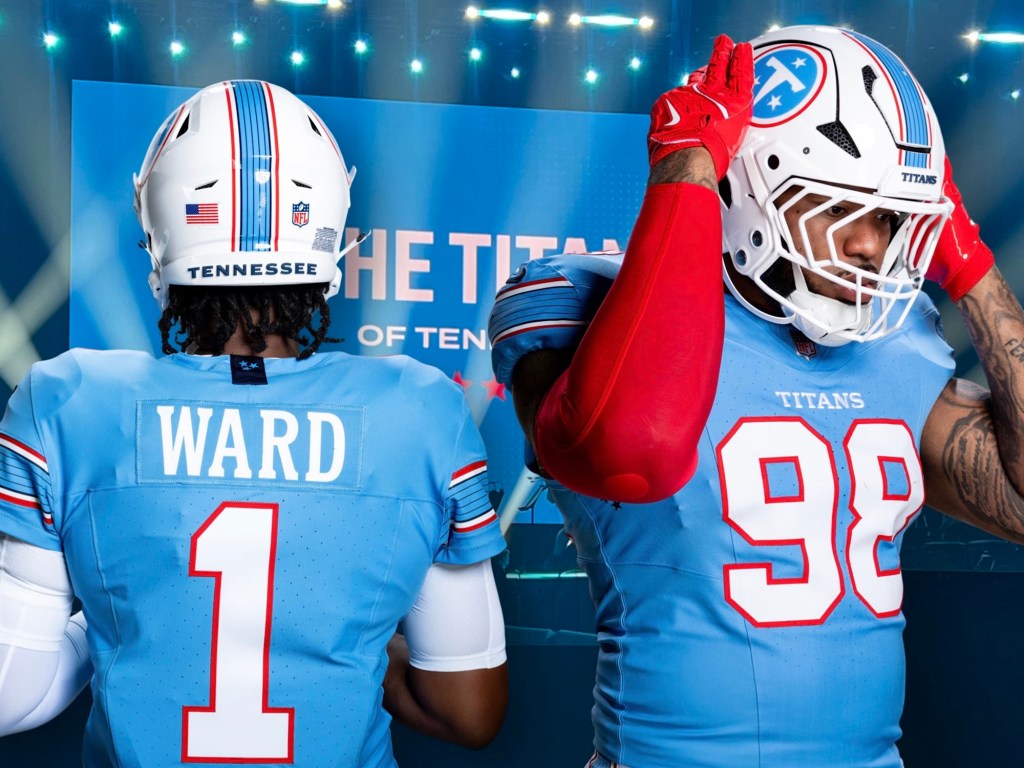
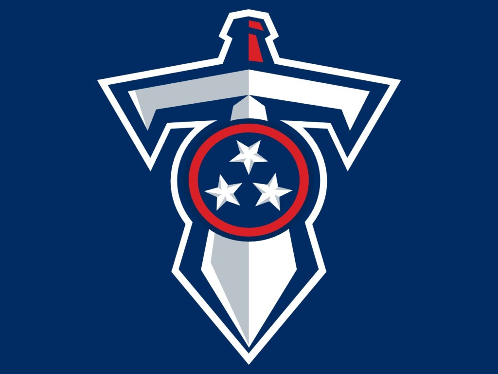
29. Tennessee Titans
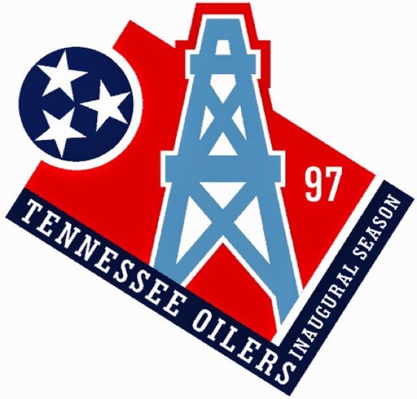
It’s 2025. Every year there’s at least one team that everyone agrees to collectively shit on. This year it’s the Titans. Not only are they a poorly ran organization, their uniforms kinda suck too. Complexity is out. Simplicity is in. And the Titans uniform is a bit too complex for my tastes. Simply ditch the sword theme and get rid of the grey altogether. And as much as I love the old Houston Oilers uniforms, it’s time to retire those. Those belong to the city of Houston. If they wanted to keep those then the Adams family should have never of changed the name to “Titans”. Does the name “Oiler” make any sense for Tennessee? No. But who gives a shit? So actually my advice to improve the uniform is to change the name back to “Oilers”. That might solve a lot of Tennessee’s problems.
I get it. I understand why Bud Adams changed it from the Oilers to the Titans. Still though, the Titans should have remained the Oilers.
“But there’s no oil in Tennessee 😭😭😭,” you say.
Who cares?
LA and Utah are hardly known for their lakes and jazz, yet that hasn’t stopped their NBA teams. I’d also like to add that the three greatest players in “Titans” history – Warren Moon, Mike Munchak, and Earl Campbell – never played a down of football in Tennessee.
Arguably, the Tennessee Titans/Houston Oilers franchise has seen their best days in Nashville (they went to a Super Bowl for instance), but forget all of that. Everyone remembers this team for one reason and reason only: those dope ass Houston Oilers uniform.
Let’s just be honest, no one likes the Titans “two tone blue.” While the solid navy blue uniforms have grown on me the past few seasons, it was always a mistake to make that the primary color over the traditional “Titans/Oilers (light) blue.”
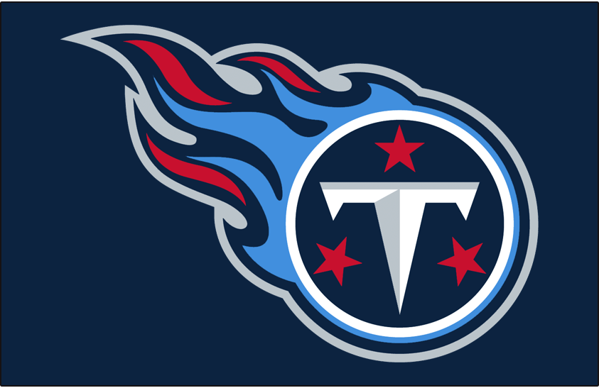
As for the logo, it’s respectable that the Titans incorporated the the three stars found on the Tennessee state flag, but it’s still a shitty logo. And they made it worse by adding an inexplicable flame to it.
Why make this the main logo when they have much better one available?
Am I crazy to think that this one’s cooler?
Slap that on the side of the helmet, revert back to the Oilers colors, and suddenly Tennessee goes from having one of the worst uniforms to one of the best!
Everybody wants this to happen. But I suppose the Adams family wants to be respectful to the city of Houston for abandoning them. But fuck ‘em! They ended up getting another (shitty) franchise!
Plus, everyone thinks the Houston Texans are a joke anyway. Nobody likes them. So if Tennessee wants fans to start liking them again, they should flush their current uniforms down the toilet and reissue the old Oilers outfits. And if they can’t do this full time, then they should just do it twice a year when they play Houston so that they can laugh in their stupid fucking faces.
Got nothin to talk abt. So I’m gonna talk about my fourth favorite subject: sports uniforms.
I tried to rank the NFL uniforms, but there’s just too damn many of them. For the CFL, there are only nine. So let’s get to them.
9. Montreal Alouettes
Fun fact: I hate this uniform. Probably the worst uniform in all of North American professional football. Why the hate? Because there’s nothing offensive about it. Much like Canada itself.
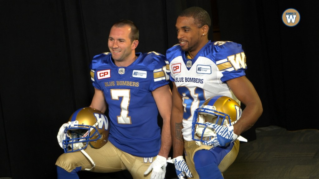
8. Winnipeg Blue Bombers
It’s pretty cool that the Washington Huskies are both an NCAA and a CFL team.
7. Toronto Argonauts
The Argonauts do a much better job of handling the two-tone blues than the Tennessee Titans. Still though, pretty uninspiring.
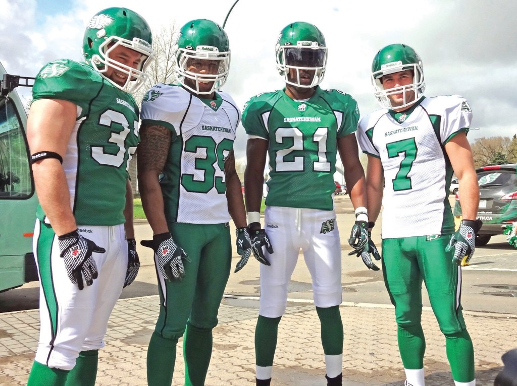
6. Saskatchewan Roughriders
Not gonna lie, the Roughriders pull off this color scheme much better than the New York Jets ever did. It’s plain and a little boring. But so is Saskatchewan.
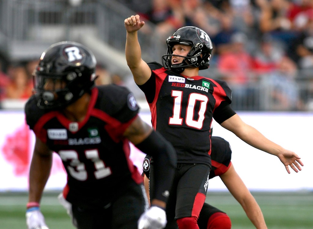
5. Ottawa Redblacks
Dumb name (I’m sure there’s some a history behind it), terrible logo, and not nearly as cool as the similarly-looking Atlanta Falcons. That being said though, not too shabby.
4. Calgary Stampeders
I’m confused as to what their uniforms are going to be rolling into the coming season, but either way, cool emblem and they definitely have the best red/black uniforms in professional football.
3. Edmonton Elks
Do they look like the Green Bay Packers? Sure. But who gives a shit? Look at that helmet!
2. BC Lions
Many would disagree, but more teams need to be wearing orange and black. My only complaint about this uniform is the BC logo. It’s a little too high schoolish. Still though, this is a thing of beauty.
1. Hamilton Tiger-cats
I’m just gonna say it: black and yellow are the two most powerful colors any team could put together. And another unpopular opinion: I like this uniform BETTER than the Pittsburgh Steelers. My only complaint is the name “tiger-cat”. Any Canadian care to explain?
In the National Football League, uniforms are important. It’s more important than in any other sport, anywhere.
If you’re gonna deliver an ass kicking, you better look good doing it. Because when you look your best, you play your best.
So here’s my ranking of all 32 uniforms, starting with #32-20.
32. Los Angeles Rams
What pisses me off about this is that the Rams did have THE BEST uniforms before SoFi Stadium got lazy and decided its two teams needed to have similar color schemes. I guess it’s too much work to redecorate the stadium each week. It’s not like any other stadium does that (MetLife).
But this new look just looks cheap: the logo, the fade from white to yellow, everything.
31. Cleveland Browns
Probably only me and Cleveland fans like the team logo: the orange helmet. But there’s nothing extraordinary about the Brown’s uniform, at least historically. And that’s okay. Being boring and underwhelming fits the team perfectly.
What pisses me off though is how they keep fucking with the basic design. Just leave well enough alone. Plus the number on the side of the helmet looks like shit. I don’t care if it’s for their “75th Anniversary” or whatever.
30. Philadelphia Eagles
Don’t get me wrong, the Eagles helmet might be the best design in the NFL. But that bluish-green just sucks. Go back to the Kelly green of the Randall Cunningham era.
29. Atlanta Falcons
The all-black uniform isn’t too bad. A red helmet would really make it pop though.
But the black top with white pants just sucks. And the “ATL” above the jersey number just looks lame.
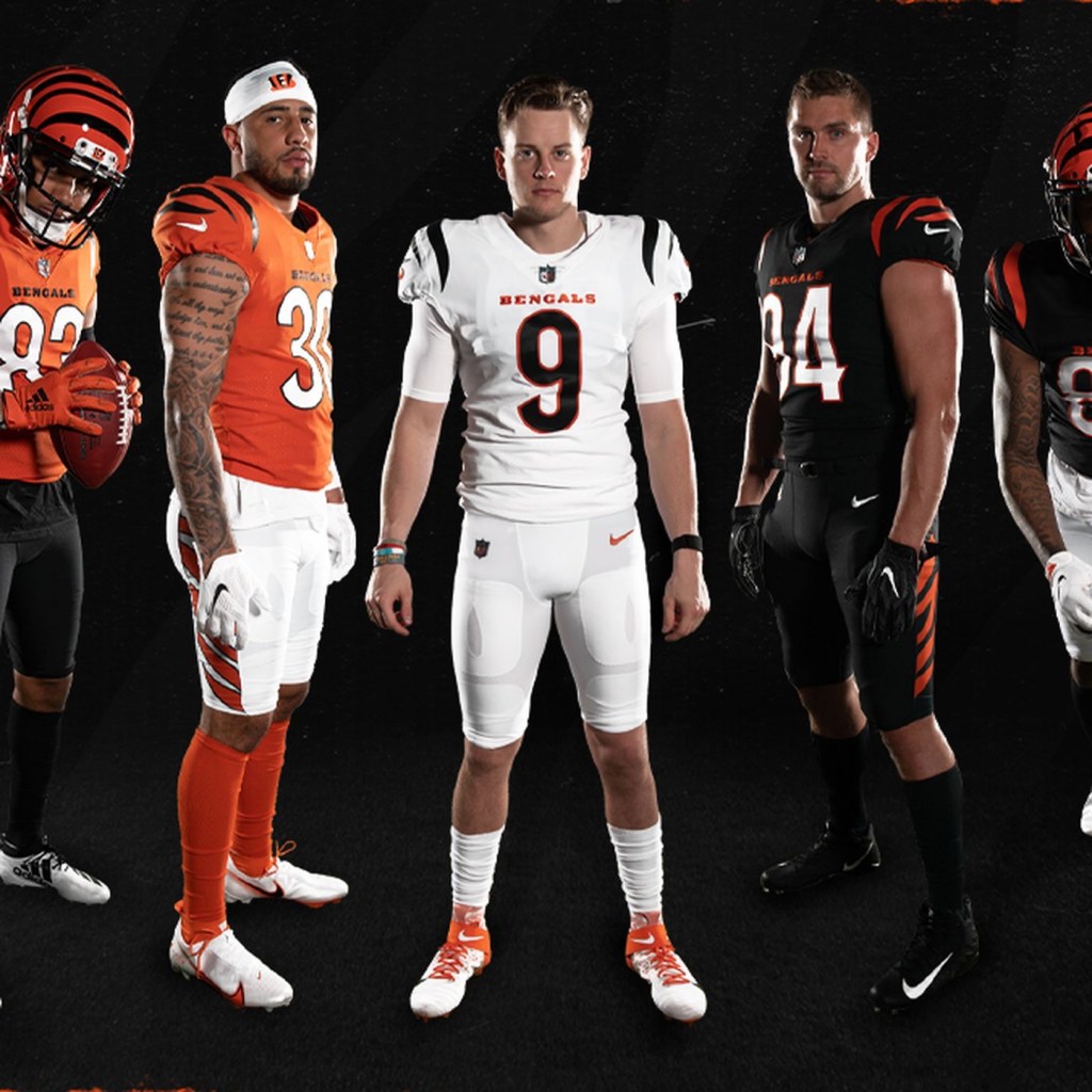
28. Cincinnati Bengals
The uniform doesn’t look too bad in this picture. But it real time, it’s just underwhelming. Unfortunately this will be the Bengals for the next 40 years because Cincinnati has the cheapest and most unoriginal ownership in the league.
Too bad we can’t fire owners.
27. Arizona Cardinals
There’s nothing wrong with boring. Apparently, some Arizona fans have embraced this plain look. But if you’re gonna be boring, embrace it. Ditch any sort of subtle design and stripes and just use straight red jerseys, socks, and white pants.
26. New York Jets
This new design doesn’t upset me as it does others. The all-black alternates suck though. Again, it’s just underwhelming, much like the franchise as a whole.
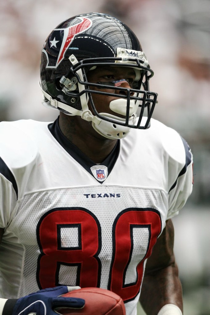
25. Houston Texans
Houston quietly has one of the best logos in the league. But those blue jerseys are unoriginal. They should make the red alternates the full-time uniform.
24. Seattle Seahawks
Seattle has never had a good uniform. And I absolutely HATED this one when I first saw it. But then Russell Wilson happened and this is slowly becoming one of the classic uniforms in the league.
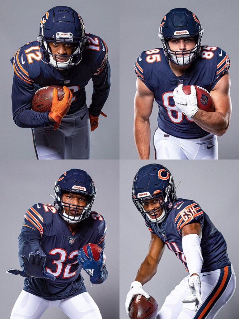
23. Chicago Bears
Eh. I don’t know. Truthfully I didn’t know where to place this one. There’s a lot of history to this uniform, so I’ll cut it some slack. But some of the alternates are preferable.
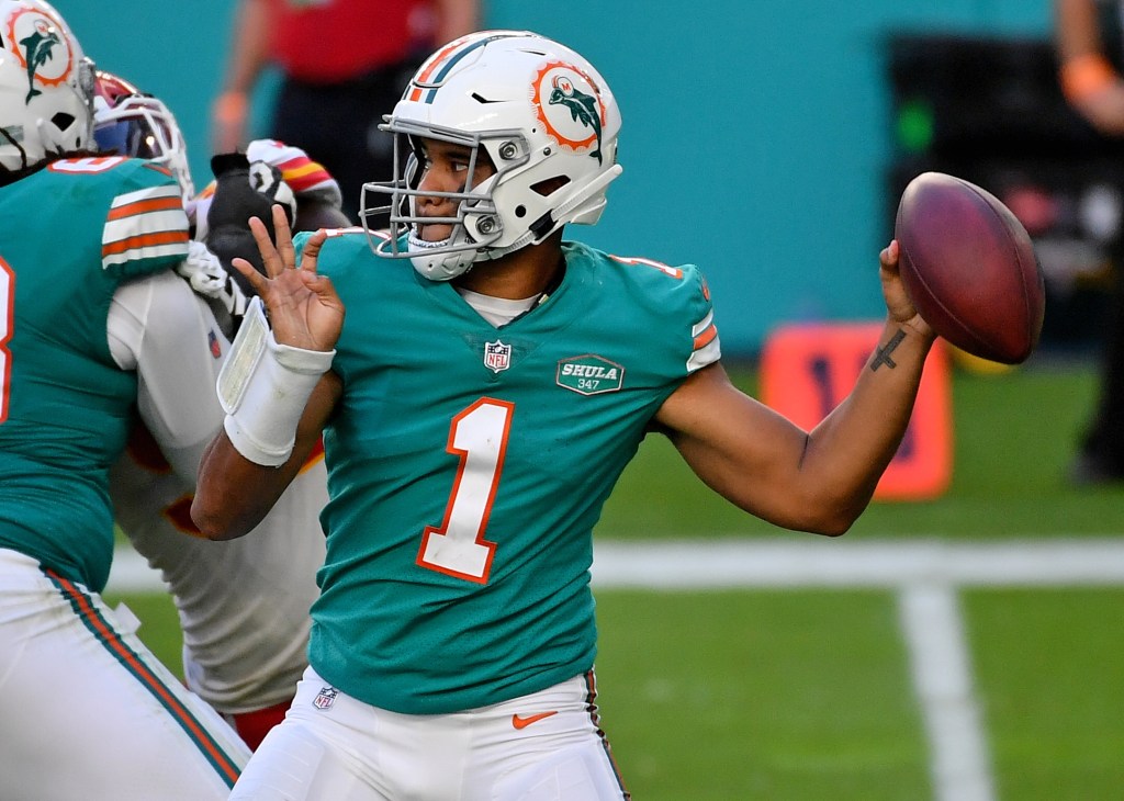
22. Miami Dolphins
Some love this color combo. I don’t. But I respect it. Just thinking about Dan Marino slinging it while wearing number 13 gives me the goosebumps. But that new logo is terrible.
21. Denver Broncos
I hate the old late-90s redesign that was used primarily before the Payton Manning era. Luckily they’ve moved away from that, and replaced it with the superior orange jerseys. Now they just need to replace that dumb Bronco logo for the old Denver ‘D’. That would look pretty dope on that helmet.
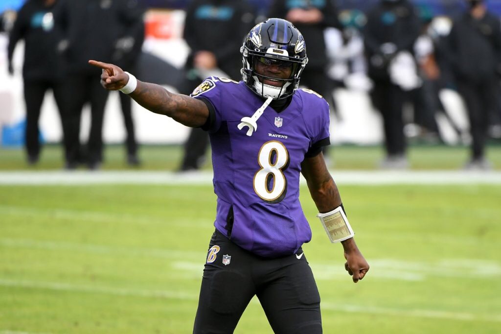
20. Baltimore Ravens
Sometimes this uniform looks cool, especially against AFC North teams and Washington. Sometimes it sucks. They should ditch the gold lining around the numbers and the all-black alternates. Otherwise, this is a pretty solid uniform.