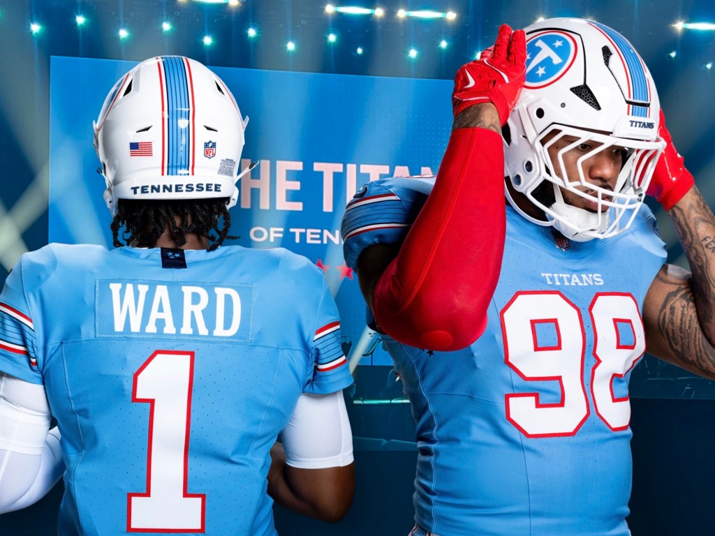
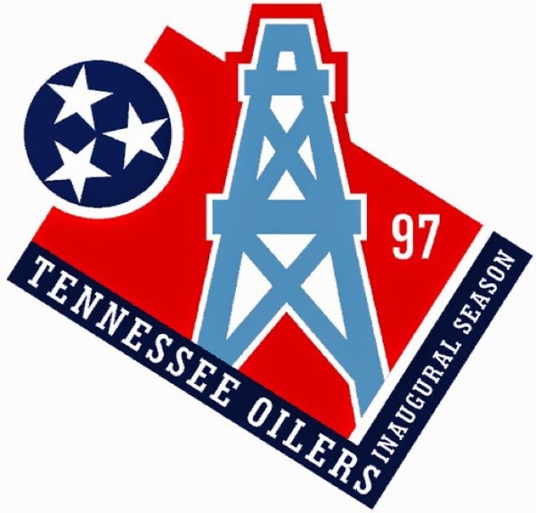
The NFL team in Nashville is having an identity crisis. This problem should be enough to keep us all awake at night. Thankfully I have a very simple solution. As you are aware by now, I have advocated for restoration of the Oilers name. I don’t do so because I prefer the old name, but because Amy Adams Strunk has painted herself into a corner and this is the only way out. Now, she’s already brought back the Oilers uniforms. So it’s time to go the extra mile.
But I have another suggestion, and this suggestion might not be as popular but nonetheless necessary. An emphasis with the new uniforms is its Nashville identity so they subtly incorporated “guitar strings” onto the helmet. Yet again, as I have complained so many times before, this is a half measure. So this is where I may kick up a hornet’s nest: the Nashville football team shouldn’t be called the “Tennessee Oilers.” They should be the Nashville Oilers.
Now I know what you’re thinking. It doesn’t necessarily roll off the tongue. But neither did “Houston Oilers” for that matter. Additionally, this might mean dropping the iconic “stars of Tennessee” from the team emblem. Whatever my detractors might think, I believe that this is a necessary measure to emphasize exclusivity; this is a team for Nashvillians and Nashvillians ONLY. And let’s just be honest, Nashville is where the cool kids of Tennessee hang out. The fair weather fans of Memphis couldn’t care less. The people of Knoxville are too busy cheering for that team of roadside construction workers. And Chattanooga might as well be in Georgia. If you want your club to be cool, you don’t make it appeal to the largest group possible. You make it exclusive. And the Oilers aren’t “Tennessee’s” team. It belongs to the cool kids of Nashville.