2025 NFL uniform ranking (part I. The worst ones)

It’s crunch time.

With a book coming out, it feels like being down three points in the fourth quarter and cramming for the finals all in one. Stress has reached a boiling point. So with a lot on my plate, I need to write about something cheap and easy. And you know me. I always have an opinion about football uniforms.

It’s been a couple years since I’ve done this. So here’s my ranking for all the 2025 NFL uniforms. Unfortunately my beef with Roger Goodell is ongoing so I won’t be able to post pictures. But that’s what the internet is for folks 🤷‍♂️

32. Seattle Seahawks

I think we can all agree that this uniform has overstayed its welcome. Actually it was never welcomed to begin with. It’s just unfortunate that this was the uniform worn during the franchise’s most successful run. But with the Legion of Boom/Russell Wilson/Pete Carroll era over, it’s time to restore the throwbacks to their proper place.

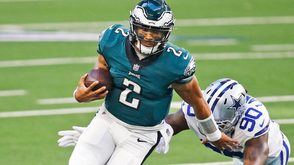
31. Philadelphia Eagles

For the life of me, I will never understand the love of midnight green. It’s boring as shit. And the shading behind the numbers makes the whole thing look dated. This uniform is stuck in the late 90s/early 2000s when everyone was depressed because of 9/11. It’s been nearly a quarter of a century, Philly. Bring back the Kelly green!

30. New England Patriots

Post Tom Brady, the Patriots have made improvements. I’ll admit, they have some good alternatives. But it’s still not enough. The biggest problem is the helmet, specifically the logo on the helmet. The internet has been quite vocal lately about the superiority of Pat Patriot over the current logo and I’m inclined to agree with them. But to improve the helmet, I have a much simpler idea: ditch the grey and make it white.

29. Tennessee Titans

It’s 2025. Every year there’s at least one team that everyone agrees to collectively shit on. This year it’s the Titans. Not only are they a poorly ran organization, their uniforms kinda suck too. Complexity is out. Simplicity is in. And the Titans uniform is a bit too complex for my tastes. Simply ditch the sword theme and get rid of the grey altogether. And as much as I love the old Houston Oilers uniforms, it’s time to retire those. Those belong to the city of Houston. If they wanted to keep those then the Adams family should have never of changed the name to “Titans”. Does the name “Oiler” make any sense for Tennessee? No. But who gives a shit? So actually my advice to improve the uniform is to change the name back to “Oilers”. That might solve a lot of Tennessee’s problems.

5 times I said “lol that sucks” while watching football

5. Fake Fair Catch- North Texas vs. Arkansas

Nothing gives me more comfort than knowing that in this day and age of NCAA football, the Arkansas Razorbacks will never win a National Championship. They’re quietly the saltiest fans in all of sports.

Which is why this fake fair catch will always bring a smile to my face.

4. Justin Tucker’s 66 yard field goal– Baltimore Ravens vs. Detroit Lions

The misery of the Detroit Lions knows no depths (as we’ll see again later). Which is why it was perfect that the football gods chose them to be on the losing end of Justin Tucker’s record-setting field goal which will never be broken in my lifetime.

Unfortunately the NFL doesn’t want me sharing clips of the event (Roger Goodell told me personally) so from here on out, I have to share shitty camera phone angles from the stands.

3. Brett Farve’s worst fuckup in a career filled with fuckups- New Orleans Saints vs. Minnesota Vikings

Everyone jumped on the Vikings bandwagon that year. But I knew better.

How did I know?

Because one snake bitten franchise, the Minnesota Vikings, had Brett Favre as their quarterback. I’m mean, come on. Everyone had to have seen this coming.

2. Michael Vick droppin bombs on Washington– Philadelphia Eagles vs. Washington R*******

People ask me all the time: when did things start going wrong the Washington team, currently the biggest dumpster fire in all of sports?

It was this moment right here, when jailbird Michael Vick made one of the greatest throws in NFL history:

1. The Motor City Miracle– Green Bay Packers vs. Detroit Lions

Sure, Aaron Rodgers may be an pompous ass. But make no mistake: he can throw a football very, very far.

After seeing a completed pass like that, it should be clear to all Lions fans: God hates Detroit. 😔

Ranking the NFL uniforms (Part 1)

In the National Football League, uniforms are important. It’s more important than in any other sport, anywhere.

If you’re gonna deliver an ass kicking, you better look good doing it. Because when you look your best, you play your best.

So here’s my ranking of all 32 uniforms, starting with #32-20.

32. Los Angeles Rams

What pisses me off about this is that the Rams did have THE BEST uniforms before SoFi Stadium got lazy and decided its two teams needed to have similar color schemes. I guess it’s too much work to redecorate the stadium each week. It’s not like any other stadium does that (MetLife).

But this new look just looks cheap: the logo, the fade from white to yellow, everything.

31. Cleveland Browns

Probably only me and Cleveland fans like the team logo: the orange helmet. But there’s nothing extraordinary about the Brown’s uniform, at least historically. And that’s okay. Being boring and underwhelming fits the team perfectly.

What pisses me off though is how they keep fucking with the basic design. Just leave well enough alone. Plus the number on the side of the helmet looks like shit. I don’t care if it’s for their “75th Anniversary” or whatever.

30. Philadelphia Eagles

Don’t get me wrong, the Eagles helmet might be the best design in the NFL. But that bluish-green just sucks. Go back to the Kelly green of the Randall Cunningham era.

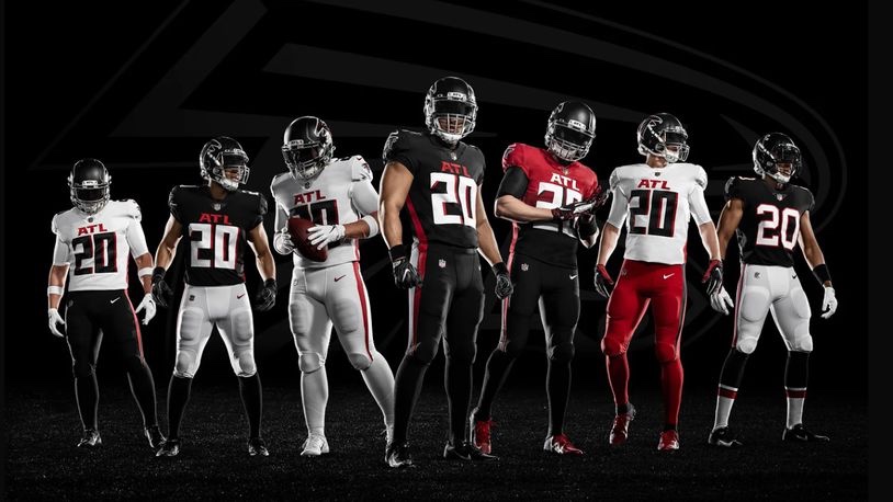
29. Atlanta Falcons

The all-black uniform isn’t too bad. A red helmet would really make it pop though.

But the black top with white pants just sucks. And the “ATL” above the jersey number just looks lame.

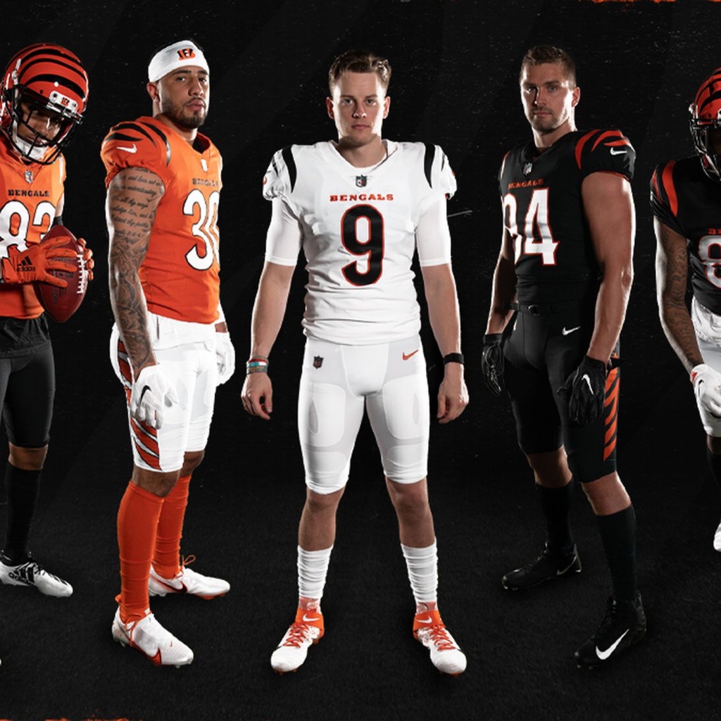
28. Cincinnati Bengals

The uniform doesn’t look too bad in this picture. But it real time, it’s just underwhelming. Unfortunately this will be the Bengals for the next 40 years because Cincinnati has the cheapest and most unoriginal ownership in the league.

Too bad we can’t fire owners.

27. Arizona Cardinals

There’s nothing wrong with boring. Apparently, some Arizona fans have embraced this plain look. But if you’re gonna be boring, embrace it. Ditch any sort of subtle design and stripes and just use straight red jerseys, socks, and white pants.

26. New York Jets

This new design doesn’t upset me as it does others. The all-black alternates suck though. Again, it’s just underwhelming, much like the franchise as a whole.

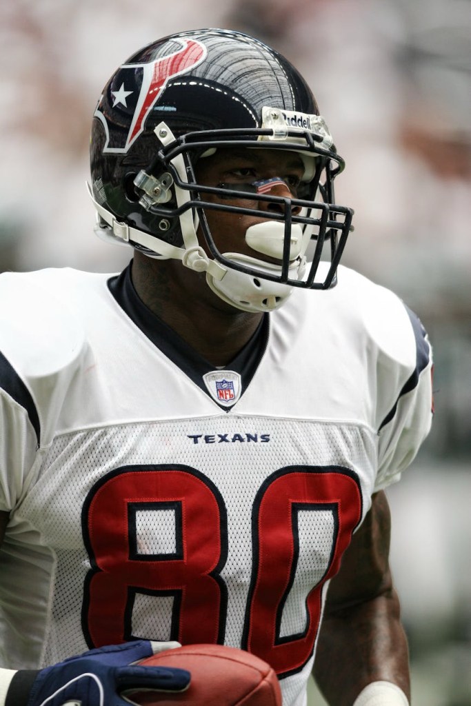
25. Houston Texans

Houston quietly has one of the best logos in the league. But those blue jerseys are unoriginal. They should make the red alternates the full-time uniform.

24. Seattle Seahawks

Seattle has never had a good uniform. And I absolutely HATED this one when I first saw it. But then Russell Wilson happened and this is slowly becoming one of the classic uniforms in the league.

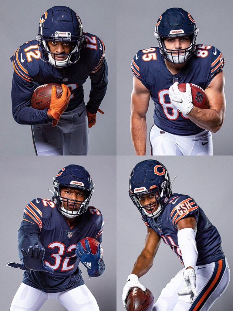
23. Chicago Bears

Eh. I don’t know. Truthfully I didn’t know where to place this one. There’s a lot of history to this uniform, so I’ll cut it some slack. But some of the alternates are preferable.

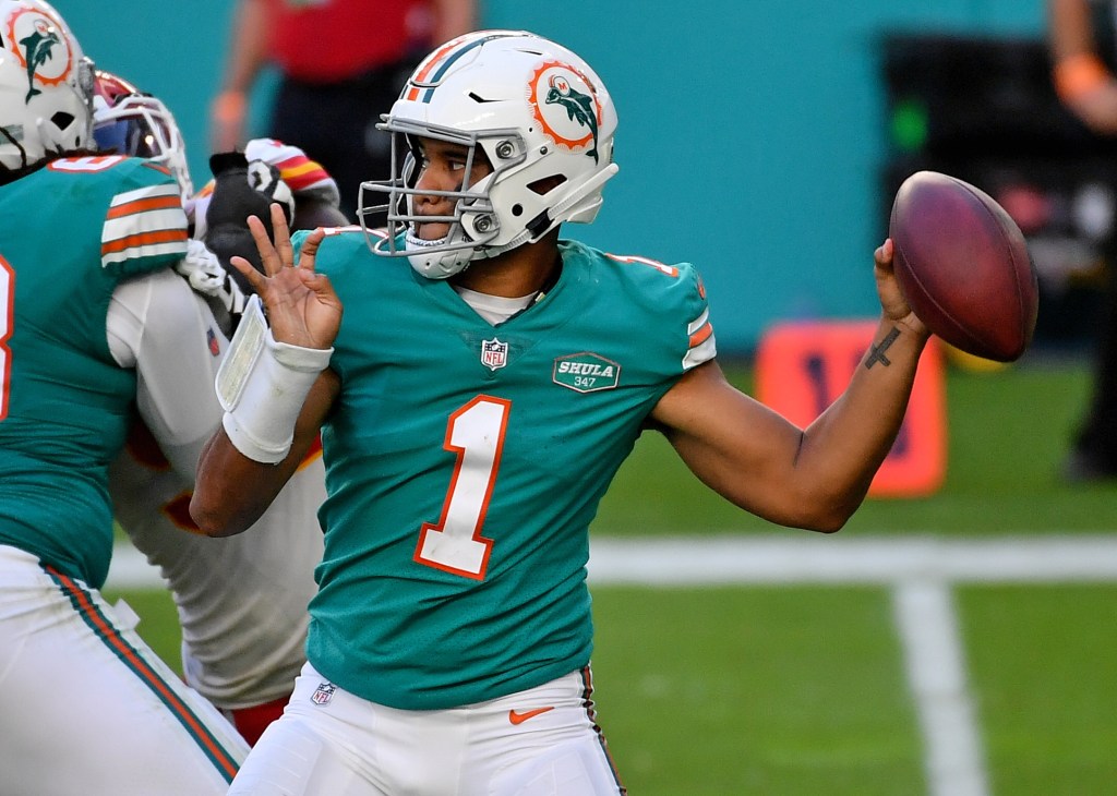
22. Miami Dolphins

Some love this color combo. I don’t. But I respect it. Just thinking about Dan Marino slinging it while wearing number 13 gives me the goosebumps. But that new logo is terrible.

21. Denver Broncos

I hate the old late-90s redesign that was used primarily before the Payton Manning era. Luckily they’ve moved away from that, and replaced it with the superior orange jerseys. Now they just need to replace that dumb Bronco logo for the old Denver ‘D’. That would look pretty dope on that helmet.

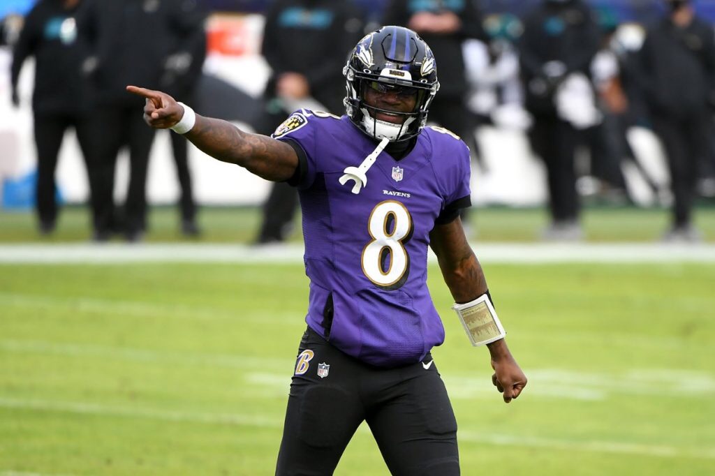
20. Baltimore Ravens

Sometimes this uniform looks cool, especially against AFC North teams and Washington. Sometimes it sucks. They should ditch the gold lining around the numbers and the all-black alternates. Otherwise, this is a pretty solid uniform.