As the internet is well aware, after the ill advised firing of Mike Vrabel by the Tennessee Titans, I renounced my fandom for NFL franchise in Nashville and proclaimed my allegiance to new titans of mediocrity in Los Angeles, the Chargers. So far, that decision has paid off in spades. Yet Tennessee still had one ace up its sleeve – or, in football parlance – one last Hail Mary to bring me back into the fold. And that hand was played today by the unveiling of new uniforms.
So. The final verdict?
Underwhelmed.
For the record, this is not a bad uniform. But I’ve made my opinion clear to anyone who would listen. If the Titans want to be the Oilers, then they should stop with these half-assed measures. Go FULL ass. BE the Tennessee Oilers for fuck sake.
But alas, we get this halfhearted nod. Which is fine. But if they really want to send this uniform over the edge, do a light blue alternate for the helmet 👍
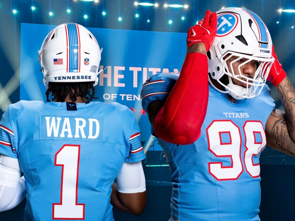
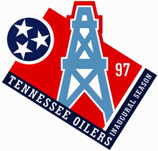
Amy Adams Strunk has done the unthinkable and followed my advice. The Tennessee Titans are seemingly returning to their roots by restoring the Houston Oilers-era colors. While many of you might think I would chalk this up as a victory, it’s not as simple as that. This is a hallowed victory—one that I had hoped would never happen.
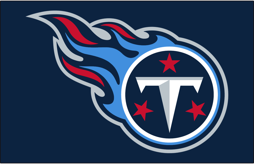
According to various reports, which I won’t cite here, the Titans are abandoning the “Greek mythology” themes by ditching the sword and flames and making the Tennessee stars of the state flag its main logo. I should say for the record that I never had a problem with the “Titans” theme. I didn’t have an issue with the theory. It was the execution that I took umbrage over. Since the news broke, many have come to the defense of the so-called “flaming thumbtack” and its “2000s maximalist” design. I will simply say that they’re wrong. That era of design sucked ass. But I will agree that the new logo is underwhelming. While I have stated repeatedly that I prefer simplicity with uniform design, I don’t feel that way about logo design. Had the Titans/Oilers always resided in Tennessee, then the new logo would have been perfectly serviceable. It’s clean and simple, just like the Steelers, Cowboys, and Green Bay for example. The difference is those teams have been historically good and never relocated. Simplicity works for them. It’s recognizable. It harkens back to the classical days of the NFL.
Which leads us to a big problem. It appears that the Titans wish to link its history in Houston with its history in Tennessee. But as any Tennessean will tell you, they don’t give a shit about its Houston era. And why should they? The Titans might as well be an expansion franchise. So in short, Bud Adams made a critical mistake in renaming the Oilers. At the very least, keeping the name in place might have resulted in the team retaining some fans in Texas. Now the Adams family wish to remedy that mistake nearly 30 years later? It’s too late. Houston has a new franchise now, the Texans, and they’re currently in a much better spot than the Titans. And btw, the Texans and Titans are divisional rivals. Restoring the old Oilers colors would only give the Texans added ammunition which they don’t need. So to me, this seems like a bad, BAD idea.
Additionally, something makes me SICK about seeing Cam Ward wear #1 in Oilers colors. Yes, I know that Warren Moon let him do it, but it doesn’t make it right. But if this is the path that the Titans wish to go down, then go all the way. Restore the Oilers name. I know that the “Tennessee Oilers” doesn’t make much sense, but as I’ve said time and time again: no one gives a shit.
Alright, let’s get this shit over with as quickly as possible. To appeal to our neighbors in the north, I will be ranking the NHL uniforms next despite not knowing dick about hockey. That seems like a natural progression. In the meantime, here’s the next part of my list:
20. Tampa Bay Buccaneers
We all know that the prior iteration, the Jameis Winston era, of this outfit was dog ass. And I mean TOTALLY dookie shoes. It was probably the worst uniform in NFL history to be honest. So they rolled back to a more solid red and pewter gray kit. It ain’t the creamsicle orange but it’s still a good uniform.
19. Miami Dolphins
Moving down to Miami, I will say that I like the newish dolphin logo. It’s probably the only “modern” design that pairs well with the uniform. Now I do have a love/hate relationship with the colors. They honestly make me want to puke. This is why I prefer the all-white throwbacks. But aqua and orange fits the city well which is why I give it a pass.
18. Dallas Cowboys
I welcome the city of Dallas’ hate with open arms. And for the record, I’m not entirely comfortable with putting the Cowboys in the lower half. But like I’ve said all along—it’s been a very strong year for uniforms. And I will say that Jerry Jones’ team does look sharp, as they historically have. But because Dallas has been THE marquee team for the last 30 years, their fresh and clean look kinda feels a tad underwhelming nowadays.
17. Cleveland Browns
Brown and orange doesn’t inspire a lot of fans but I respect the choice. It feels old school. Though I don’t know what the consensus is on the alternatives, I do prefer the solid brown outfit with orange numbers. It’s a fresh take on an old concept.
Brain ain’t working too good again so I’m back to phoning it in. This time about NFL uniforms. Like I said, in my estimation, this has been a very strong year for NFL uniforms and there’s not one in the bunch that I despise with all my being. So if your team is near the bottom, that sucks. There’s just too many good contenders.
24. Chicago Bears
The navy blue, white, and orange striping is a solid look. Personally, I prefer the orange alternatives but they aren’t wearing those this year. Chicago did the right thing and made the pissed off bear it’s official logo. But now is time to do the righter thing: slap that bear decal on the side of the helmet.
23. Arizona Cardinals
Shout out to Arizona for keeping their uniforms boring. That’s tradition and I’m glad they’re sticking to it. My problem isn’t with the all red and all white home/away kit. My problem is with the all black alts and cream “rivalry” outfit. Teams need to understand that they aren’t as cool as the Raiders, Steelers, and Saints (or even Panthers and Falcons for that matter). Let them wear black cuz the rest of y’all look like try-hards. And that cream kit? It looks like a rejected Oklahoma Sooner alternative.
22. Denver Broncos
Because there’s so many good uniforms, I have to get nitpicky here. If the throwbacks were the primary outfit, the Broncos might have the best uniform in the league. While I think navy blue and orange mesh well together, the jagged markings on the sleeves just don’t work for me. Plus (and I might be in the minority on this) I think the logo has overstayed its welcome.
21. Los Angeles Rams
This uniform has improved significantly in my rankings. I HATED it when it first debuted. But I’ve come to respect it — NOT love it —but there are things I appreciate. The royal blue and golden yellow remain incredible together. Ditch the color gradient on the numbers and this kit might move up one spot.
To be honest, there’s not too many uniforms I hate. In fact, this is probably the strongest year for uniforms since I’ve started following the National Football League back in 1923. That’s why it’s taken so long to write a follow up. None of these are bad! It’s just a small tweak here or there that I would change, but otherwise the NFL is having a banner year for uniforms. (Don’t forget, Roger Goodell will sue the SHIT out of me if repost any pictures here. So if you’re curious, just use Google 🙏 sry)
28. New York Giants
Before North Jersey dispatches the mafia to bust my knee caps, I should say that this is a good uniform. Honestly, I like it. In my mind, it’s one of the classic uniforms. It’s along the lines of the Dallas Cowboys, Pittsburgh Steelers, Green Bay Packers, etc. The problem is that it’s the weakest in that category. Ditching the grey pants of the Eli Manning era was a good move. While the white pants they’ve been wearing for nearly a decade has been a slight improvement, I think it’s time to make a switch to all blue/all white for home and away.
27. Buffalo Bills
The Bills are similar to the New York Giants uniform wise, but they do a much better job at managing the colors. However, this might be my most controversial opinion: I don’t like their logo. Never have. It’s one of the few logos that needs a modern redesign. Yet simultaneously, I think they should make the throwbacks — the red helmets of the Jim Kelly era — their full time uniform.
26. Atlanta Falcons
Someone, and I don’t know who, needs to stop overthinking this goddamn uniform. The answer is painfully obvious to both fans and haters alike: the Atlanta Falcons uniform is a red helmet, black jersey, and white pants. So, you hear me Arthur Blank? Stop fuckin with perfection!
25. Carolina Panthers
Panthers have a rare opportunity to go from the near bottom of this list to the absolute top. And we all know what the solution is. It’s no secret. Ditch the grey helmet and make the black one full time. That’s the obvious solution. But I have a better one: how about a blue helmet with an all black uniform for home games? Just sayin
I’m reasonably convinced that Tom Brady is the antichrist. Is it because he’s rich, handsome, and won seven Super Bowls? No. It’s because he cloned his dog that died two years ago.
“That’s just typical rich people shit,” you might say.
And you’re right! But if you know Tom Brady like I know Tom Brady, then you’d also know that it won’t end there. This is only the beginning. Today, it’s dogs. Tomorrow, it’s Tom Brady himself. What started off as a stupid throwaway joke from a forgotten Paul Rudd show will escalate into full on defiance of god himself. This is the end times. The dawning of the foretold apocalypse. The imagination of Peter Thiel run amok. When Tom Brady crosses the threshold of immortality via Colossal Bioscience, humanity’s days are numbered.
Death, grief, and appreciating life’s finitude is the cornerstone of the human condition. When those chains are cast off, what do we become? The universe is cold and unforgiving. But in the amoral vacuum of space and time is a small shred of transcendent substance called consciousness. It is here for a brief shining moment and is suddenly gone like a flicker in the night. Knowing this flame will someday burn out gives meaning to our lives.
But for a man with seven titles and recognized the world over as the greatest athlete of all time, one life isn’t enough. He will reincarnate himself again and again, living the same charmed life as before and breaking new records as his reenergized body enters the draft to continue his reign of terror on the NFL.
And all for what? Because he was taken in the sixth round?
We’re playing god. And when you’re playing god, prepare to tango with the Devil
With a book coming out, it feels like being down three points in the fourth quarter and cramming for the finals all in one. Stress has reached a boiling point. So with a lot on my plate, I need to write about something cheap and easy. And you know me. I always have an opinion about football uniforms.
It’s been a couple years since I’ve done this. So here’s my ranking for all the 2025 NFL uniforms. Unfortunately my beef with Roger Goodell is ongoing so I won’t be able to post pictures. But that’s what the internet is for folks 🤷♂️
32. Seattle Seahawks
I think we can all agree that this uniform has overstayed its welcome. Actually it was never welcomed to begin with. It’s just unfortunate that this was the uniform worn during the franchise’s most successful run. But with the Legion of Boom/Russell Wilson/Pete Carroll era over, it’s time to restore the throwbacks to their proper place.
31. Philadelphia Eagles
For the life of me, I will never understand the love of midnight green. It’s boring as shit. And the shading behind the numbers makes the whole thing look dated. This uniform is stuck in the late 90s/early 2000s when everyone was depressed because of 9/11. It’s been nearly a quarter of a century, Philly. Bring back the Kelly green!
30. New England Patriots
Post Tom Brady, the Patriots have made improvements. I’ll admit, they have some good alternatives. But it’s still not enough. The biggest problem is the helmet, specifically the logo on the helmet. The internet has been quite vocal lately about the superiority of Pat Patriot over the current logo and I’m inclined to agree with them. But to improve the helmet, I have a much simpler idea: ditch the grey and make it white.
29. Tennessee Titans
It’s 2025. Every year there’s at least one team that everyone agrees to collectively shit on. This year it’s the Titans. Not only are they a poorly ran organization, their uniforms kinda suck too. Complexity is out. Simplicity is in. And the Titans uniform is a bit too complex for my tastes. Simply ditch the sword theme and get rid of the grey altogether. And as much as I love the old Houston Oilers uniforms, it’s time to retire those. Those belong to the city of Houston. If they wanted to keep those then the Adams family should have never of changed the name to “Titans”. Does the name “Oiler” make any sense for Tennessee? No. But who gives a shit? So actually my advice to improve the uniform is to change the name back to “Oilers”. That might solve a lot of Tennessee’s problems.
Sorry folks. I’m in an undisclosed Eastern European black site. My hands are tied, both literally and figuratively, so I haven’t been able to write much. But to keep you entertained, I was going through some of my unpublished drafts and I came across this doozy. Clearly I’m a Nostradamus at predicting NFL seasons. Need proof? Well read and weep my friends. EVERYTHING came true:
***
Since I was absolutely 100% correct in my Super Bowl predictions, here are my predictions for the upcoming NFL season:
-Mike McCarthy will get fired less than six games into the season. Kellen Moore is named HC. Dallas Cowboys make the playoffs. Moore is named Coach of the Year.
-Jared Goff will be Comeback Player of the Year.
-Buffalo Bills, Los Angeles Chargers, and Las Vegas Raiders will all fall below expectations.
-Kevin Byard will be named Defensive Player of the Year.
-Tom Brady will have another 5000 yard season. Will NOT win MVP. Despite playing at a high level, he WILL retire at the end of the season and this time he’ll mean it.
-NFC Championship: Los Angeles Rams/Green Bay Packers
-AFC Championship: Kansas City Chiefs AND….The DENVER FUCKING BRONCOS!!!!!
-A player will expose himself on the sideline.
-Aaron Rodgers will have a bizarre press conference and people will begin wondering about his mental state if they weren’t doing so already. Will win another MVP.
-Aaron Donald will kill a man (non-player) on the field.
-A game will be moved back a day due to “safety concerns” 🤔
-Troy Aikman will cry while calling a game.
-Matt Rhule will pull a Steve Sarkisian, coach a game drunk, and WIN.
I get it. I understand why Bud Adams changed it from the Oilers to the Titans. Still though, the Titans should have remained the Oilers.
“But there’s no oil in Tennessee 😭😭😭,” you say.
Who cares?
LA and Utah are hardly known for their lakes and jazz, yet that hasn’t stopped their NBA teams. I’d also like to add that the three greatest players in “Titans” history – Warren Moon, Mike Munchak, and Earl Campbell – never played a down of football in Tennessee.
Arguably, the Tennessee Titans/Houston Oilers franchise has seen their best days in Nashville (they went to a Super Bowl for instance), but forget all of that. Everyone remembers this team for one reason and reason only: those dope ass Houston Oilers uniform.
Let’s just be honest, no one likes the Titans “two tone blue.” While the solid navy blue uniforms have grown on me the past few seasons, it was always a mistake to make that the primary color over the traditional “Titans/Oilers (light) blue.”
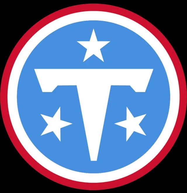
As for the logo, it’s respectable that the Titans incorporated the the three stars found on the Tennessee state flag, but it’s still a shitty logo. And they made it worse by adding an inexplicable flame to it.
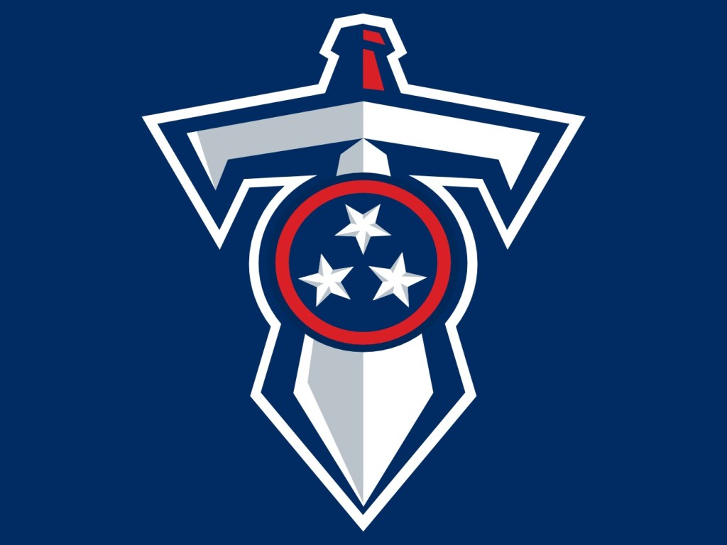
Why make this the main logo when they have much better one available?
Am I crazy to think that this one’s cooler?
Slap that on the side of the helmet, revert back to the Oilers colors, and suddenly Tennessee goes from having one of the worst uniforms to one of the best!
Everybody wants this to happen. But I suppose the Adams family wants to be respectful to the city of Houston for abandoning them. But fuck ‘em! They ended up getting another (shitty) franchise!
Plus, everyone thinks the Houston Texans are a joke anyway. Nobody likes them. So if Tennessee wants fans to start liking them again, they should flush their current uniforms down the toilet and reissue the old Oilers outfits. And if they can’t do this full time, then they should just do it twice a year when they play Houston so that they can laugh in their stupid fucking faces.
The family’s been sick all week. I was the only one that got the shits.
What’s up with that?
But the most tragic news of the week has been the firing of Jack Easterby. I’m quite surprised because I figured that Cal McNair was dumb enough to keep this charlatan on the payroll. But it’s just not everyday that you hear about one man’s Machiavellian climb to the top of an NFL franchise.
So I really hope that another Christian sports owner gives this guy a shot. Because if there’s one thing I know about Easterby, it’s that he knows his ABG’s:
Always Be Grifting.
In happier news, the 1996 Jan De Bont classic Twister is getting a sequel:
The major obstacles in this production, so far, has been the deaths of Bill Paxton and Philip Seymour Hoffman. Producer Steven Spielberg has gone on record as saying, “of course it would be fucking stupid to make sequel without Bill and Phil,” he said, “so naturally we’ll CGI them into Twister 2, just like they did to Grand Moff Tarkin in that Star Wars movie. Everyone seemed to have liked that. And besides, that’s a hell of a lot cheaper than hiring actors! Fuck that!”
While Deadline has reported that climate change will be a major focus in the film, it has also been stated that the plot will be centered on the daughter of Bill Paxton and Helen Hunt who has become a “climate change denier” that claims tornadoes are actually a “divine wrath from God” on the the state of Oklahoma.
So I don’t know guys, this seems like another strange decision from Hollywood. Nevertheless, I am quite excited for this long awaited sequel.