Alright, let’s get this shit over with as quickly as possible. To appeal to our neighbors in the north, I will be ranking the NHL uniforms next despite not knowing dick about hockey. That seems like a natural progression. In the meantime, here’s the next part of my list:
20. Tampa Bay Buccaneers
We all know that the prior iteration, the Jameis Winston era, of this outfit was dog ass. And I mean TOTALLY dookie shoes. It was probably the worst uniform in NFL history to be honest. So they rolled back to a more solid red and pewter gray kit. It ain’t the creamsicle orange but it’s still a good uniform.
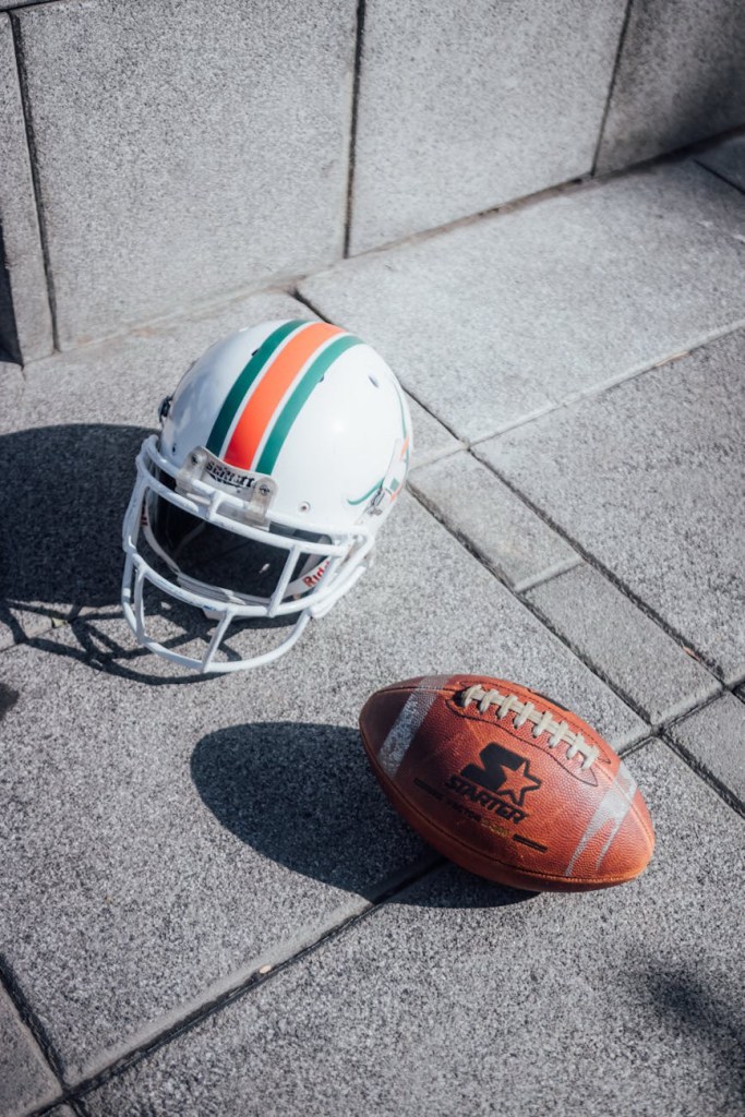
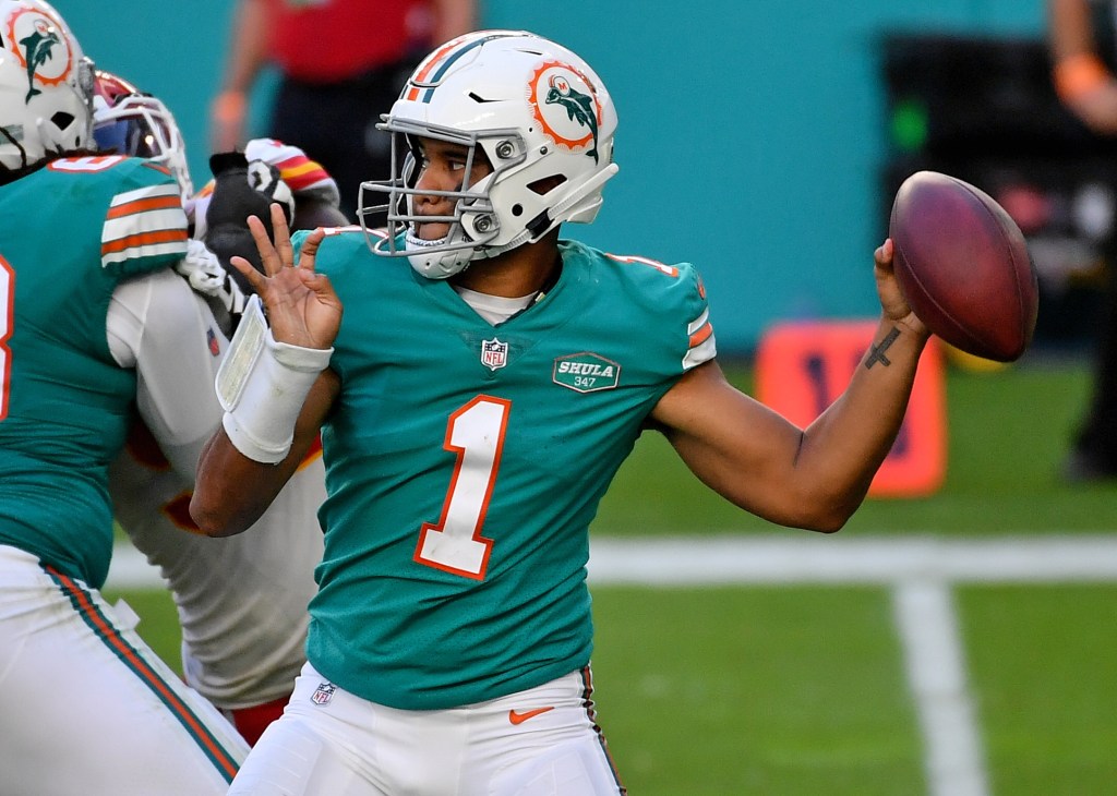
19. Miami Dolphins
Moving down to Miami, I will say that I like the newish dolphin logo. It’s probably the only “modern” design that pairs well with the uniform. Now I do have a love/hate relationship with the colors. They honestly make me want to puke. This is why I prefer the all-white throwbacks. But aqua and orange fits the city well which is why I give it a pass.
18. Dallas Cowboys
I welcome the city of Dallas’ hate with open arms. And for the record, I’m not entirely comfortable with putting the Cowboys in the lower half. But like I’ve said all along—it’s been a very strong year for uniforms. And I will say that Jerry Jones’ team does look sharp, as they historically have. But because Dallas has been THE marquee team for the last 30 years, their fresh and clean look kinda feels a tad underwhelming nowadays.
17. Cleveland Browns
Brown and orange doesn’t inspire a lot of fans but I respect the choice. It feels old school. Though I don’t know what the consensus is on the alternatives, I do prefer the solid brown outfit with orange numbers. It’s a fresh take on an old concept.
In the National Football League, uniforms are important. It’s more important than in any other sport, anywhere.
If you’re gonna deliver an ass kicking, you better look good doing it. Because when you look your best, you play your best.
So here’s my ranking of all 32 uniforms, starting with #32-20.
32. Los Angeles Rams
What pisses me off about this is that the Rams did have THE BEST uniforms before SoFi Stadium got lazy and decided its two teams needed to have similar color schemes. I guess it’s too much work to redecorate the stadium each week. It’s not like any other stadium does that (MetLife).
But this new look just looks cheap: the logo, the fade from white to yellow, everything.
31. Cleveland Browns
Probably only me and Cleveland fans like the team logo: the orange helmet. But there’s nothing extraordinary about the Brown’s uniform, at least historically. And that’s okay. Being boring and underwhelming fits the team perfectly.
What pisses me off though is how they keep fucking with the basic design. Just leave well enough alone. Plus the number on the side of the helmet looks like shit. I don’t care if it’s for their “75th Anniversary” or whatever.
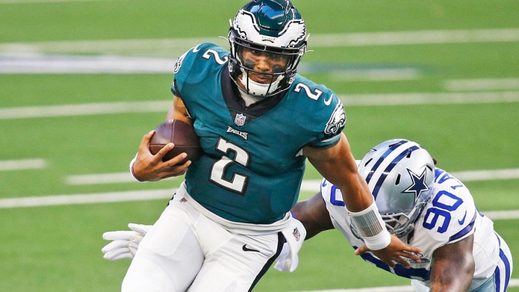
30. Philadelphia Eagles
Don’t get me wrong, the Eagles helmet might be the best design in the NFL. But that bluish-green just sucks. Go back to the Kelly green of the Randall Cunningham era.
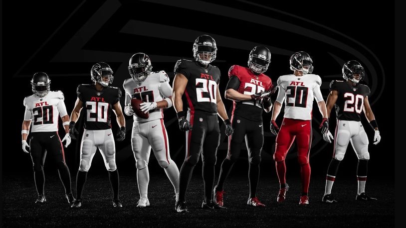
29. Atlanta Falcons
The all-black uniform isn’t too bad. A red helmet would really make it pop though.
But the black top with white pants just sucks. And the “ATL” above the jersey number just looks lame.
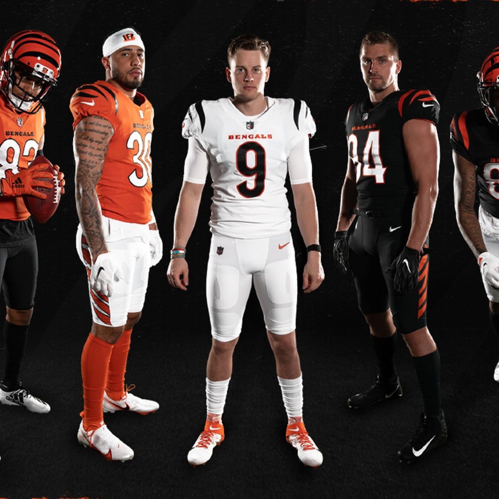
28. Cincinnati Bengals
The uniform doesn’t look too bad in this picture. But it real time, it’s just underwhelming. Unfortunately this will be the Bengals for the next 40 years because Cincinnati has the cheapest and most unoriginal ownership in the league.
Too bad we can’t fire owners.
27. Arizona Cardinals
There’s nothing wrong with boring. Apparently, some Arizona fans have embraced this plain look. But if you’re gonna be boring, embrace it. Ditch any sort of subtle design and stripes and just use straight red jerseys, socks, and white pants.
26. New York Jets
This new design doesn’t upset me as it does others. The all-black alternates suck though. Again, it’s just underwhelming, much like the franchise as a whole.
25. Houston Texans
Houston quietly has one of the best logos in the league. But those blue jerseys are unoriginal. They should make the red alternates the full-time uniform.
24. Seattle Seahawks
Seattle has never had a good uniform. And I absolutely HATED this one when I first saw it. But then Russell Wilson happened and this is slowly becoming one of the classic uniforms in the league.
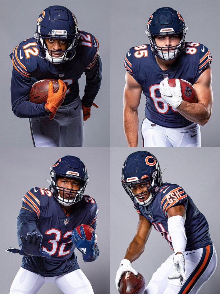
23. Chicago Bears
Eh. I don’t know. Truthfully I didn’t know where to place this one. There’s a lot of history to this uniform, so I’ll cut it some slack. But some of the alternates are preferable.
22. Miami Dolphins
Some love this color combo. I don’t. But I respect it. Just thinking about Dan Marino slinging it while wearing number 13 gives me the goosebumps. But that new logo is terrible.
21. Denver Broncos
I hate the old late-90s redesign that was used primarily before the Payton Manning era. Luckily they’ve moved away from that, and replaced it with the superior orange jerseys. Now they just need to replace that dumb Bronco logo for the old Denver ‘D’. That would look pretty dope on that helmet.
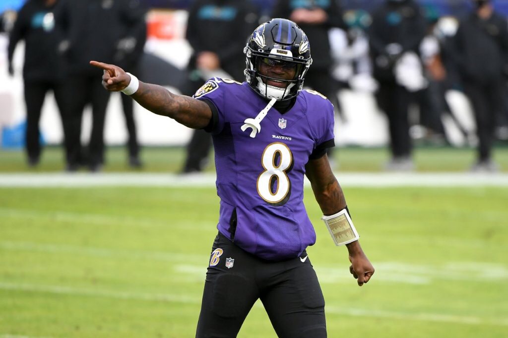
20. Baltimore Ravens
Sometimes this uniform looks cool, especially against AFC North teams and Washington. Sometimes it sucks. They should ditch the gold lining around the numbers and the all-black alternates. Otherwise, this is a pretty solid uniform.