2025 NFL uniform ranking (part II: meh)

To be honest, there’s not too many uniforms I hate. In fact, this is probably the strongest year for uniforms since I’ve started following the National Football League back in 1923. That’s why it’s taken so long to write a follow up. None of these are bad! It’s just a small tweak here or there that I would change, but otherwise the NFL is having a banner year for uniforms. (Don’t forget, Roger Goodell will sue the SHIT out of me if repost any pictures here. So if you’re curious, just use Google 🙏 sry)

28. New York Giants

Before North Jersey dispatches the mafia to bust my knee caps, I should say that this is a good uniform. Honestly, I like it. In my mind, it’s one of the classic uniforms. It’s along the lines of the Dallas Cowboys, Pittsburgh Steelers, Green Bay Packers, etc. The problem is that it’s the weakest in that category. Ditching the grey pants of the Eli Manning era was a good move. While the white pants they’ve been wearing for nearly a decade has been a slight improvement, I think it’s time to make a switch to all blue/all white for home and away.

27. Buffalo Bills

The Bills are similar to the New York Giants uniform wise, but they do a much better job at managing the colors. However, this might be my most controversial opinion: I don’t like their logo. Never have. It’s one of the few logos that needs a modern redesign. Yet simultaneously, I think they should make the throwbacks — the red helmets of the Jim Kelly era — their full time uniform.
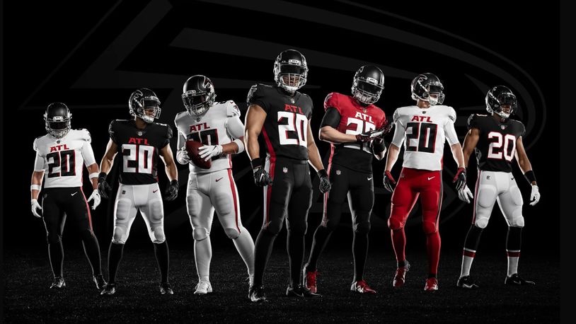
26. Atlanta Falcons

Someone, and I don’t know who, needs to stop overthinking this goddamn uniform. The answer is painfully obvious to both fans and haters alike: the Atlanta Falcons uniform is a red helmet, black jersey, and white pants. So, you hear me Arthur Blank? Stop fuckin with perfection!

25. Carolina Panthers

Panthers have a rare opportunity to go from the near bottom of this list to the absolute top. And we all know what the solution is. It’s no secret. Ditch the grey helmet and make the black one full time. That’s the obvious solution. But I have a better one: how about a blue helmet with an all black uniform for home games? Just sayin

Ranking the NFL uniforms (Part 1)

In the National Football League, uniforms are important. It’s more important than in any other sport, anywhere.

If you’re gonna deliver an ass kicking, you better look good doing it. Because when you look your best, you play your best.

So here’s my ranking of all 32 uniforms, starting with #32-20.

32. Los Angeles Rams

What pisses me off about this is that the Rams did have THE BEST uniforms before SoFi Stadium got lazy and decided its two teams needed to have similar color schemes. I guess it’s too much work to redecorate the stadium each week. It’s not like any other stadium does that (MetLife).

But this new look just looks cheap: the logo, the fade from white to yellow, everything.

31. Cleveland Browns

Probably only me and Cleveland fans like the team logo: the orange helmet. But there’s nothing extraordinary about the Brown’s uniform, at least historically. And that’s okay. Being boring and underwhelming fits the team perfectly.

What pisses me off though is how they keep fucking with the basic design. Just leave well enough alone. Plus the number on the side of the helmet looks like shit. I don’t care if it’s for their “75th Anniversary” or whatever.

30. Philadelphia Eagles

Don’t get me wrong, the Eagles helmet might be the best design in the NFL. But that bluish-green just sucks. Go back to the Kelly green of the Randall Cunningham era.

29. Atlanta Falcons

The all-black uniform isn’t too bad. A red helmet would really make it pop though.

But the black top with white pants just sucks. And the “ATL” above the jersey number just looks lame.

28. Cincinnati Bengals

The uniform doesn’t look too bad in this picture. But it real time, it’s just underwhelming. Unfortunately this will be the Bengals for the next 40 years because Cincinnati has the cheapest and most unoriginal ownership in the league.

Too bad we can’t fire owners.

27. Arizona Cardinals

There’s nothing wrong with boring. Apparently, some Arizona fans have embraced this plain look. But if you’re gonna be boring, embrace it. Ditch any sort of subtle design and stripes and just use straight red jerseys, socks, and white pants.

26. New York Jets

This new design doesn’t upset me as it does others. The all-black alternates suck though. Again, it’s just underwhelming, much like the franchise as a whole.

25. Houston Texans

Houston quietly has one of the best logos in the league. But those blue jerseys are unoriginal. They should make the red alternates the full-time uniform.

24. Seattle Seahawks

Seattle has never had a good uniform. And I absolutely HATED this one when I first saw it. But then Russell Wilson happened and this is slowly becoming one of the classic uniforms in the league.

23. Chicago Bears

Eh. I don’t know. Truthfully I didn’t know where to place this one. There’s a lot of history to this uniform, so I’ll cut it some slack. But some of the alternates are preferable.

22. Miami Dolphins

Some love this color combo. I don’t. But I respect it. Just thinking about Dan Marino slinging it while wearing number 13 gives me the goosebumps. But that new logo is terrible.

21. Denver Broncos

I hate the old late-90s redesign that was used primarily before the Payton Manning era. Luckily they’ve moved away from that, and replaced it with the superior orange jerseys. Now they just need to replace that dumb Bronco logo for the old Denver ‘D’. That would look pretty dope on that helmet.

20. Baltimore Ravens

Sometimes this uniform looks cool, especially against AFC North teams and Washington. Sometimes it sucks. They should ditch the gold lining around the numbers and the all-black alternates. Otherwise, this is a pretty solid uniform.