2025 NFL uniform ranking (part iii- getting better)

Brain ain’t working too good again so I’m back to phoning it in. This time about NFL uniforms. Like I said, in my estimation, this has been a very strong year for NFL uniforms and there’s not one in the bunch that I despise with all my being. So if your team is near the bottom, that sucks. There’s just too many good contenders.

24. Chicago Bears

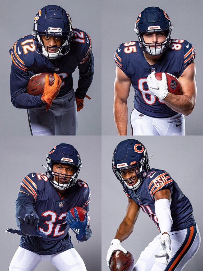
The navy blue, white, and orange striping is a solid look. Personally, I prefer the orange alternatives but they aren’t wearing those this year. Chicago did the right thing and made the pissed off bear it’s official logo. But now is time to do the righter thing: slap that bear decal on the side of the helmet.

23. Arizona Cardinals

Shout out to Arizona for keeping their uniforms boring. That’s tradition and I’m glad they’re sticking to it. My problem isn’t with the all red and all white home/away kit. My problem is with the all black alts and cream “rivalry” outfit. Teams need to understand that they aren’t as cool as the Raiders, Steelers, and Saints (or even Panthers and Falcons for that matter). Let them wear black cuz the rest of y’all look like try-hards. And that cream kit? It looks like a rejected Oklahoma Sooner alternative.

22. Denver Broncos

Because there’s so many good uniforms, I have to get nitpicky here. If the throwbacks were the primary outfit, the Broncos might have the best uniform in the league. While I think navy blue and orange mesh well together, the jagged markings on the sleeves just don’t work for me. Plus (and I might be in the minority on this) I think the logo has overstayed its welcome.

21. Los Angeles Rams

This uniform has improved significantly in my rankings. I HATED it when it first debuted. But I’ve come to respect it — NOT love it —but there are things I appreciate. The royal blue and golden yellow remain incredible together. Ditch the color gradient on the numbers and this kit might move up one spot.

Bruce arians HoFer

It’s day three being tobacco free. Everyone and every THING pisses me off.

Bruce Arians retired. Which was enough to annoy me. Then I read this bullshit:

Well TOO late buddy! You guys should have thought of that before putting Jimmy “fucking” Johnson in the Hall of Fame.

When it was announced a few years ago that Johnson was going to be inducted, many were shocked that he wasn’t already in. I was the only one shocked they were letting him in at all.

“😭😭But he’s got two Super Bowl rings and restored the Dallas Cowboys as America’s team 😭😭,” you might cry.

Well guess what? Have you ever considered that Jerry Jones was RIGHT when he said any coach could have led the Cowboys to the Super Bowl…especially after Barry Switzer won one two seasons later with the same team?

That’s right: I’m Team Jerry Jones in this fight!

And besides, according to Mike Asti, we shouldn’t count Johnson’s two Super Bowl wins because the Cowboys had a stacked roster that included THE MOST SUCCESSFUL RUNNING BACK OF ALL TIME.

Sorry, if you have a talented roster and you’re a head coach, you don’t get credit for the wins. I don’t make the rules 🤷‍♂️

My point is that Jimmy Johnson (and, honestly, Dick Vermeil) is the benchmarks that all modern coaches must hurdle if they want to make the Hall of Fame.

And Bruce Arians hurdles it pretty well. Arians’ career was technically shorter than Johnson’s: 8 full seasons as a head coach, and one season as an interim for 12 games (a season in which, it should be noted, he won NFL Coach of the Year). In those 8 full seasons, Arians became the winningest coach for one team (Arizona Cardinals) and led the other one (Tampa Bay Buccaneers) to a Super Bowl win. His win/loss record, including the playoffs in that 8 year stretch is 86-51-1. If you include the one year as interim HC for the Indianapolis Colts (where again, he won CoY), that record stretches to 95-54-1…in nine seasons.

Jimmy Johnson’s record in nine seasons (including the playoffs)? 89-68.

Yes, both coaches only achieved 2 division titles. And Johnson went to the postseason 6 times compared to Arians’ 4. But again, the HoF committee would have to reckon with Arians’ one “unofficial” year as Indy’s head coach, because that team DID go to the playoffs (where Chuck Pagano resumed head coaching duties). So, technically, Arians went to the playoffs 5 times.

Also, Arians won CoY twice, where Johnson won once. Might not mean much, but every little bit helps.

Therefore Bruce Arians’ career can be summed up here: 95-54-1, 2xCoY, 1xSB winner.

Compared to Johnson: 89-68, 1xCoY, 2xSB winner.

Look, I’m not saying that Bruce Arians SHOULD be in the Hall. My argument is that if you’re gonna put Jimmy Johnson in, you definitely have to put Arians in.

Ranking the NFL uniforms (Part 1)

In the National Football League, uniforms are important. It’s more important than in any other sport, anywhere.

If you’re gonna deliver an ass kicking, you better look good doing it. Because when you look your best, you play your best.

So here’s my ranking of all 32 uniforms, starting with #32-20.

32. Los Angeles Rams

What pisses me off about this is that the Rams did have THE BEST uniforms before SoFi Stadium got lazy and decided its two teams needed to have similar color schemes. I guess it’s too much work to redecorate the stadium each week. It’s not like any other stadium does that (MetLife).

But this new look just looks cheap: the logo, the fade from white to yellow, everything.

31. Cleveland Browns

Probably only me and Cleveland fans like the team logo: the orange helmet. But there’s nothing extraordinary about the Brown’s uniform, at least historically. And that’s okay. Being boring and underwhelming fits the team perfectly.

What pisses me off though is how they keep fucking with the basic design. Just leave well enough alone. Plus the number on the side of the helmet looks like shit. I don’t care if it’s for their “75th Anniversary” or whatever.

30. Philadelphia Eagles

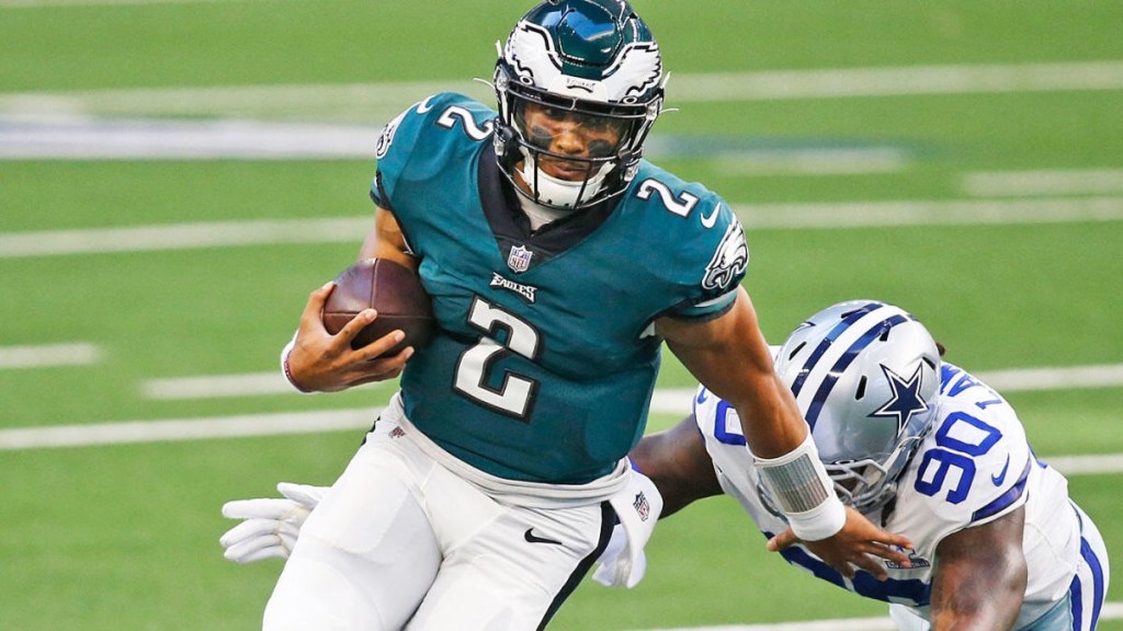
Don’t get me wrong, the Eagles helmet might be the best design in the NFL. But that bluish-green just sucks. Go back to the Kelly green of the Randall Cunningham era.

29. Atlanta Falcons

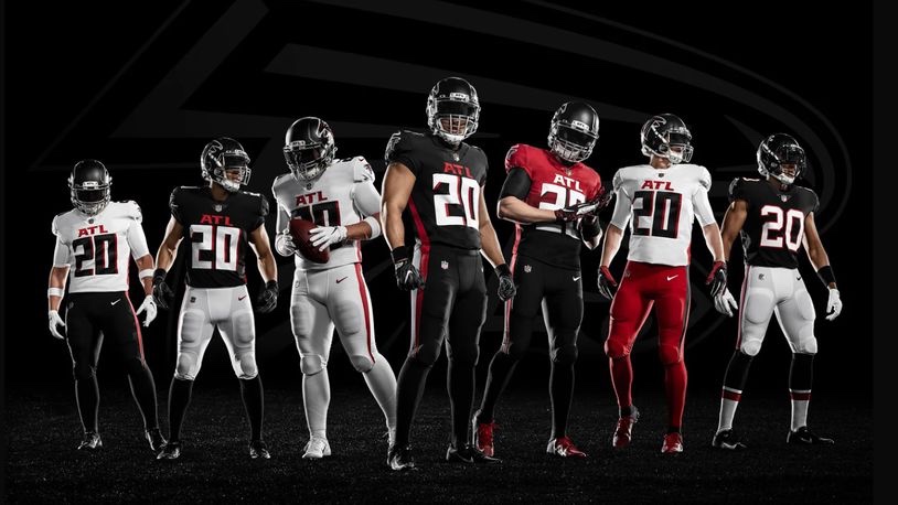
The all-black uniform isn’t too bad. A red helmet would really make it pop though.

But the black top with white pants just sucks. And the “ATL” above the jersey number just looks lame.

28. Cincinnati Bengals

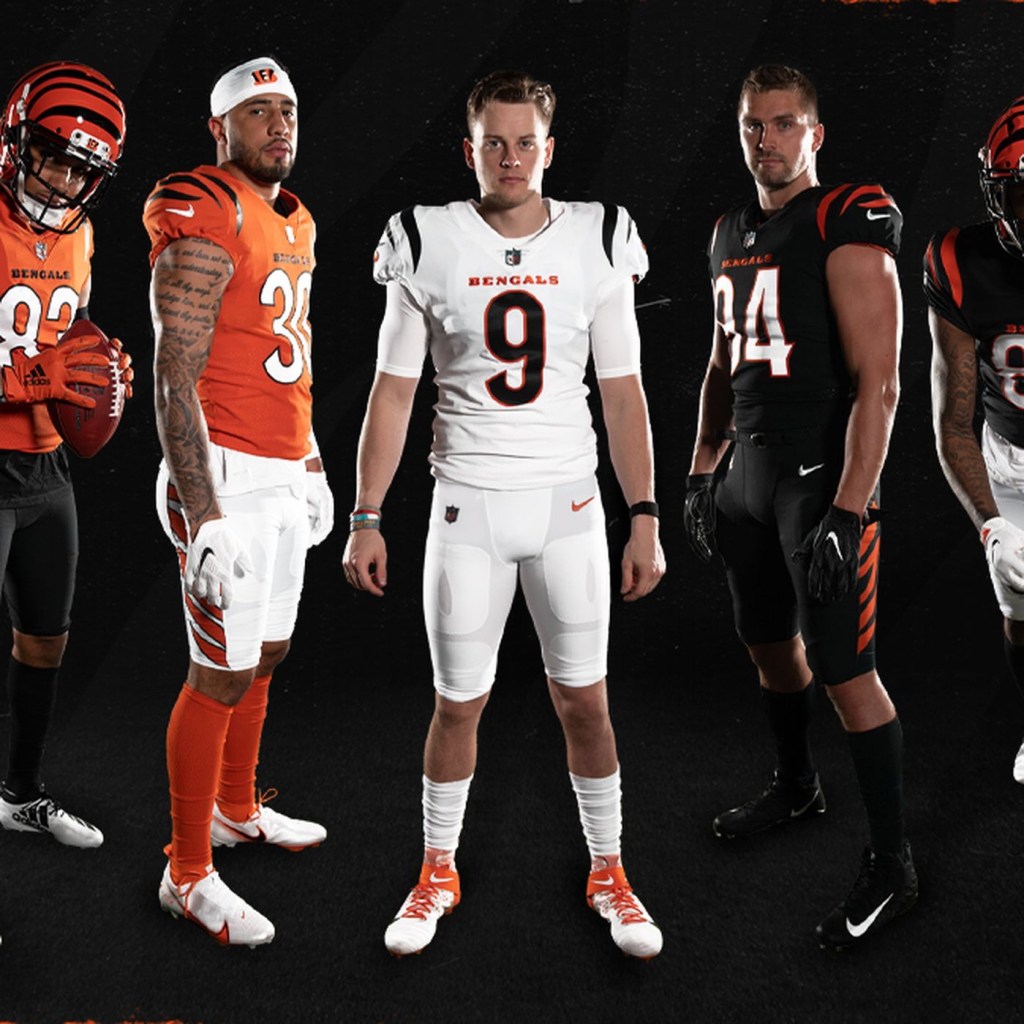
The uniform doesn’t look too bad in this picture. But it real time, it’s just underwhelming. Unfortunately this will be the Bengals for the next 40 years because Cincinnati has the cheapest and most unoriginal ownership in the league.

Too bad we can’t fire owners.

27. Arizona Cardinals

There’s nothing wrong with boring. Apparently, some Arizona fans have embraced this plain look. But if you’re gonna be boring, embrace it. Ditch any sort of subtle design and stripes and just use straight red jerseys, socks, and white pants.

26. New York Jets

This new design doesn’t upset me as it does others. The all-black alternates suck though. Again, it’s just underwhelming, much like the franchise as a whole.

25. Houston Texans

Houston quietly has one of the best logos in the league. But those blue jerseys are unoriginal. They should make the red alternates the full-time uniform.

24. Seattle Seahawks

Seattle has never had a good uniform. And I absolutely HATED this one when I first saw it. But then Russell Wilson happened and this is slowly becoming one of the classic uniforms in the league.

23. Chicago Bears

Eh. I don’t know. Truthfully I didn’t know where to place this one. There’s a lot of history to this uniform, so I’ll cut it some slack. But some of the alternates are preferable.

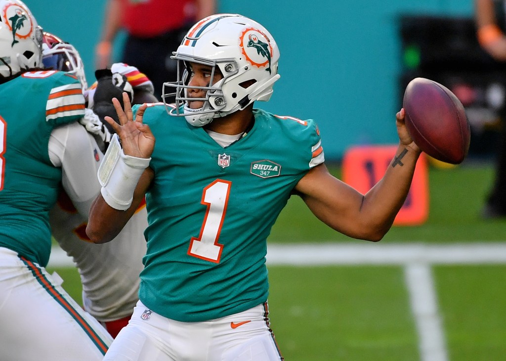
22. Miami Dolphins

Some love this color combo. I don’t. But I respect it. Just thinking about Dan Marino slinging it while wearing number 13 gives me the goosebumps. But that new logo is terrible.

21. Denver Broncos

I hate the old late-90s redesign that was used primarily before the Payton Manning era. Luckily they’ve moved away from that, and replaced it with the superior orange jerseys. Now they just need to replace that dumb Bronco logo for the old Denver ‘D’. That would look pretty dope on that helmet.

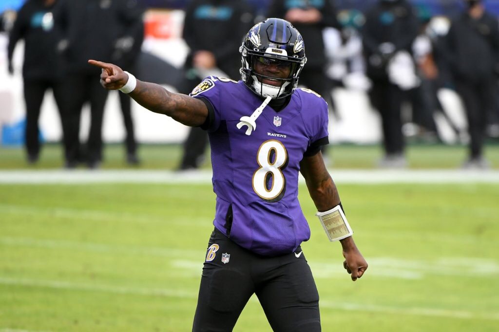
20. Baltimore Ravens

Sometimes this uniform looks cool, especially against AFC North teams and Washington. Sometimes it sucks. They should ditch the gold lining around the numbers and the all-black alternates. Otherwise, this is a pretty solid uniform.