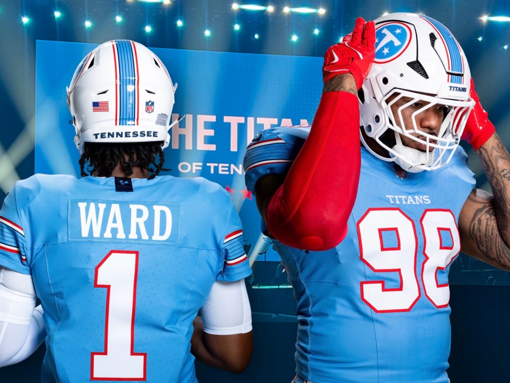
2025 NFL uniform ranking (part iv-the good shit)

Alright, let’s get this shit over with as quickly as possible. To appeal to our neighbors in the north, I will be ranking the NHL uniforms next despite not knowing dick about hockey. That seems like a natural progression. In the meantime, here’s the next part of my list:

20. Tampa Bay Buccaneers

We all know that the prior iteration, the Jameis Winston era, of this outfit was dog ass. And I mean TOTALLY dookie shoes. It was probably the worst uniform in NFL history to be honest. So they rolled back to a more solid red and pewter gray kit. It ain’t the creamsicle orange but it’s still a good uniform.

19. Miami Dolphins

Moving down to Miami, I will say that I like the newish dolphin logo. It’s probably the only “modern” design that pairs well with the uniform. Now I do have a love/hate relationship with the colors. They honestly make me want to puke. This is why I prefer the all-white throwbacks. But aqua and orange fits the city well which is why I give it a pass.

18. Dallas Cowboys

I welcome the city of Dallas’ hate with open arms. And for the record, I’m not entirely comfortable with putting the Cowboys in the lower half. But like I’ve said all along—it’s been a very strong year for uniforms. And I will say that Jerry Jones’ team does look sharp, as they historically have. But because Dallas has been THE marquee team for the last 30 years, their fresh and clean look kinda feels a tad underwhelming nowadays.

17. Cleveland Browns

Brown and orange doesn’t inspire a lot of fans but I respect the choice. It feels old school. Though I don’t know what the consensus is on the alternatives, I do prefer the solid brown outfit with orange numbers. It’s a fresh take on an old concept.

Oh Canada😏

Through all the pain, misery, depression, crippling anxiety, diabetes, and mounds and mounds of self loathing, there’s still one thing I look forward to. In this day and age of misinformation, disinformation, economic uncertainty, deteriorating infrastructure, rising unemployment, political instability, climate change, senseless wars, endless online brain rot, spiraling death cults of personality, unwanted artificial intelligence, oligarchical domination, hatred towards the other, rolling back of civil rights, and an overwhelming sense of damnation from god, we must find joy wherever it may be found.

And you can find that joy specifically at Tim Hortons

Their delightful customer service will help you pick out the perfect coffee to stave off suicidal ideation for one more day with their choice of French Vanilla, iced cappuccino, mocha latte, or original blend.

Thinking about “detonating” your vehicle in a crowded downtown area? Consider picking up a delicious sausage and egg bagel before you do.

You see, at Tim Horton’s, we make modern life only slightly more bearable. We may not be able to cure your ass cancer or crippling medical debt, but we can make this meaningless odyssey towards death a bit tastier with our chocolate glazed donuts and cinnamon croissant muffins.

So run to the toilet and vomit up them sleeping pills! And when you’re done with that, stop into your local Tim Hortons and thank the pagan gods for creating Canada 🇨🇦

Tim Hortons ™️: Toujours frais, toujours Tim Hortons!

2025 NFL uniform ranking (part iii- getting better)

Brain ain’t working too good again so I’m back to phoning it in. This time about NFL uniforms. Like I said, in my estimation, this has been a very strong year for NFL uniforms and there’s not one in the bunch that I despise with all my being. So if your team is near the bottom, that sucks. There’s just too many good contenders.

24. Chicago Bears

The navy blue, white, and orange striping is a solid look. Personally, I prefer the orange alternatives but they aren’t wearing those this year. Chicago did the right thing and made the pissed off bear it’s official logo. But now is time to do the righter thing: slap that bear decal on the side of the helmet.

23. Arizona Cardinals

Shout out to Arizona for keeping their uniforms boring. That’s tradition and I’m glad they’re sticking to it. My problem isn’t with the all red and all white home/away kit. My problem is with the all black alts and cream “rivalry” outfit. Teams need to understand that they aren’t as cool as the Raiders, Steelers, and Saints (or even Panthers and Falcons for that matter). Let them wear black cuz the rest of y’all look like try-hards. And that cream kit? It looks like a rejected Oklahoma Sooner alternative.

22. Denver Broncos

Because there’s so many good uniforms, I have to get nitpicky here. If the throwbacks were the primary outfit, the Broncos might have the best uniform in the league. While I think navy blue and orange mesh well together, the jagged markings on the sleeves just don’t work for me. Plus (and I might be in the minority on this) I think the logo has overstayed its welcome.

21. Los Angeles Rams

This uniform has improved significantly in my rankings. I HATED it when it first debuted. But I’ve come to respect it — NOT love it —but there are things I appreciate. The royal blue and golden yellow remain incredible together. Ditch the color gradient on the numbers and this kit might move up one spot.

checkmate

Aaron Burr. Deforest Kelley. Stonewall Jackson. Daniel Webster. JP Morgan. Dylan McDermott. Grover Cleveland. Henry Cabot Lodge. George Custer. Doc Holliday. Tom Cruise. Fatty Arbuckle. Hernando De Soto. Kaiser Wilhelm II. Norm Van Brocklin. William Jennings Bryan. William Jefferson Clinton. Johnny “Fuckin” Appleseed. Chip Kelly. Alfred Hitchcock. Adolf Hitler. Richard Nixon. Jim Jones. Bob Balaban. George Patton. George Kennedy. Howard Cosell. Jesus Christ. Bob Dole. Joe Rogan. Steve Urkel. Russell Brand. Dylan McDermott. Terry Crews. Terry Bradshaw. Terry Gilliam. Terry Ferrel. Terry O’Quinn. Terry Fox. Terry Prachett. Terry Chen. Terry Dodson. Preston Terry. And now Quentin Tarantino….

What do all these men have in common?

I hated them before all of you.

So remember: It always pays to jump on the hate train early 👍

son of a bitch!

In my ongoing blood feud with Amazon.com CEO Jeffrey Bezos, the billionaire has made me a laughing stock by publishing my latest book Vanitas (available on Amazon.com) in the size of a goddamn college textbook. You could say I’m partially to blame because I “don’t understand how dimensions work”. But we all know that’s bullshit.

Bezos set me up for failure. Plain and simple.

Now I could theoretically go back on Amazon KDP and adjust the dimensions to make the physical copy more aligned with a traditional paperback size. But that would be admitting defeat. I don’t make mistakes. Every action I take is a highly calculated and I execute it without error. This time is no different.

Jeff Bezos thought he lured me into making an error. But the truth is he was an unwitting agent working on my behalf. In other words, while he was playing checkers, I was playing 4D Chess. Confused? Let me walk you through this. When Vanitas was published, Bezos thought he was confusing me with all these “dimensions” to choose from (16×9, 6×9, 420×69, etc). But little did he know that Vanitas was such a perfect product that it didn’t matter what size the physical copy would be. IN FACT, the larger the better. Because if Hollywood comes a-callin’, Vanitas would be automatically available in script size. So BAM! I just saved producers time AND money.

THAT’S called thinking four steps ahead! THAT’S called being a genius! So checkmate you bald bastard!

Get your copy of Vanitas TODAY at Amazon.com!

What are you doing with your life?

Are you a sad sack of shit?

Do you take dick pills because your dick don’t work?

Do you ever consider waving a gun at the police because “life just ain’t worth living no more”?

Well I have good news for you! Vanitas is now available on Amazon!

But I don’t want to clutter my home with useless shit!” you bitch and moan. Well guess what! You can also purchase it on Kindle!

Do you have it in audiobook form?”

Fuck no! What’s your deal? Do you not know how to read?! Get to Amazon.com and give Jeff Bezos $9.99 for a shitty copy of Vanitas today!

(And I mean TODAY you cheap son of a bitch!)

I’m so embarrassed 🙈

So I was minding my business at Home Depot when an employee harassed me by the power tools. He came up to me slightly perturbed with an abundance of rage radiating from his eyes. He came to me and said “do you need help sir?”

I nodded and told him, “Yes. I’ve been standing here for 8 hours waiting for someone to help me! Can you tell me the difference between the Ryobi 18V impact drill and the DeWalt 20v orbital sander?!”

“Of course sir. One’s an impact drill and the other is a sander.”

“Uh huh. And which one would you recommend to clean out a p-trap?”

“I recommend you go to the plumbing department for that.”

Finally I had enough of his shit. “Don’t get snappy with me young man!” I told him. “I’m just looking to find tulips to plant in my garden! Don’t be a fuckin asshole! What’s happened to this country!? Used to be a man could come to Home Depot and get his salad tossed in the paint department! Now he can’t even get tugged off in the garden department! Your generation has fucked everything up!”

“But I’m 78 years old sir.”

“Oh yeah?” I said sarcastically. “Well if you’re so smart, can you tell me where to find spark plugs?!”

“For your lawn mower?”

“No! For my 85 Dodge Daytona!”

The employee nodded and gently placed his had on my shoulder. “I think you’re looking for an AutoZone sir,” he said.

Boy did I have egg on my face! 😅

For the record

Sometimes I check my stats and see a post I completely forgot about. Then I read the post and ask myself how many percocets I took before I wrote that. I’m referring to this post specifically.

I ain’t gonna explain it because I’m not gonna read all that shit. So I’ll just say that I disagree with everything I wrote. It’s nonsensical. Plus, I’m a changed man now. I’m off the barbiturates and I’m thinking much more clearly nowadays. So please disregard everything that I wrote from 1947 to 2023. It was a wild time in my life. Plus I was trying to fly under the radar of the CIA and the House Committee of Un-American Activities.

Thought I’d clear the air

thanks

Thanksgiving?

More like TAINTsgiving, amirite? 😏

Anyways, hope all of my readers in AMERICA (the only country that matters) had a wonderful thanksgiving weekend. May god have mercy on your toilets and diabetes and may the spirits of genocided indigenous people grant us peace before white people receive their final reckoning for their crimes against humanity for our days are numbered and the revenant of Crazy Horse and Monctezuma will strike us dead. So I hope you got your fill of pumpkin pie and stuffed turkey, for when the day of judgement comes, god will have no mercy.

As for me, I’m thankful for all my friends and readers.

Onto Christmas!

2025 NFL uniform ranking (part II: meh)

To be honest, there’s not too many uniforms I hate. In fact, this is probably the strongest year for uniforms since I’ve started following the National Football League back in 1923. That’s why it’s taken so long to write a follow up. None of these are bad! It’s just a small tweak here or there that I would change, but otherwise the NFL is having a banner year for uniforms. (Don’t forget, Roger Goodell will sue the SHIT out of me if repost any pictures here. So if you’re curious, just use Google 🙏 sry)

28. New York Giants

Before North Jersey dispatches the mafia to bust my knee caps, I should say that this is a good uniform. Honestly, I like it. In my mind, it’s one of the classic uniforms. It’s along the lines of the Dallas Cowboys, Pittsburgh Steelers, Green Bay Packers, etc. The problem is that it’s the weakest in that category. Ditching the grey pants of the Eli Manning era was a good move. While the white pants they’ve been wearing for nearly a decade has been a slight improvement, I think it’s time to make a switch to all blue/all white for home and away.

27. Buffalo Bills

The Bills are similar to the New York Giants uniform wise, but they do a much better job at managing the colors. However, this might be my most controversial opinion: I don’t like their logo. Never have. It’s one of the few logos that needs a modern redesign. Yet simultaneously, I think they should make the throwbacks — the red helmets of the Jim Kelly era — their full time uniform.

26. Atlanta Falcons

Someone, and I don’t know who, needs to stop overthinking this goddamn uniform. The answer is painfully obvious to both fans and haters alike: the Atlanta Falcons uniform is a red helmet, black jersey, and white pants. So, you hear me Arthur Blank? Stop fuckin with perfection!

25. Carolina Panthers

Panthers have a rare opportunity to go from the near bottom of this list to the absolute top. And we all know what the solution is. It’s no secret. Ditch the grey helmet and make the black one full time. That’s the obvious solution. But I have a better one: how about a blue helmet with an all black uniform for home games? Just sayin